Reduce Bounce Rates and Keep Visitors Engaged


Imagine you’re throwing a party. You spend hours curating the perfect playlist, lay out mouthwatering snacks, and clean the bathroom (even behind the toilet). But your first guests walk in, glance around, and head right back out the door. No goodbyes, nothing! Just…gone. Brutal.
That, in a nutshell, is what a high bounce rate looks like on your website.
Bounce rate measures the percentage of people who visit a page on your site and then leave without clicking, scrolling, or engaging. In other words, they come, they see, they ghost.
While a high bounce rate isn’t always a cause for panic (more on that in a minute), consistently high bounce rates can be a red flag. They signal that your site might be confusing, irrelevant, slow, or just not giving people what they expected to find.
The good news? Fixing bounce rate issues usually doesn’t require rebuilding your entire site. With a few smart, strategic tweaks, you can encourage visitors to stay, explore, and engage.
This guide walks you through exactly what bounce rate is, how to check it, what benchmarks to aim for, and how to reduce it with practical, easy-to-implement strategies that work. No matter what you’re working on, we’ll help you turn those bounces into longer visits and better results. Let’s dive in.
What Is a Bounce Rate (and Why Does It Matter)?
Bounce rate is a metric that shows the percentage of visitors who land on a single page of your website and then leave without taking any action —no clicks, no scrolling, no form fills.
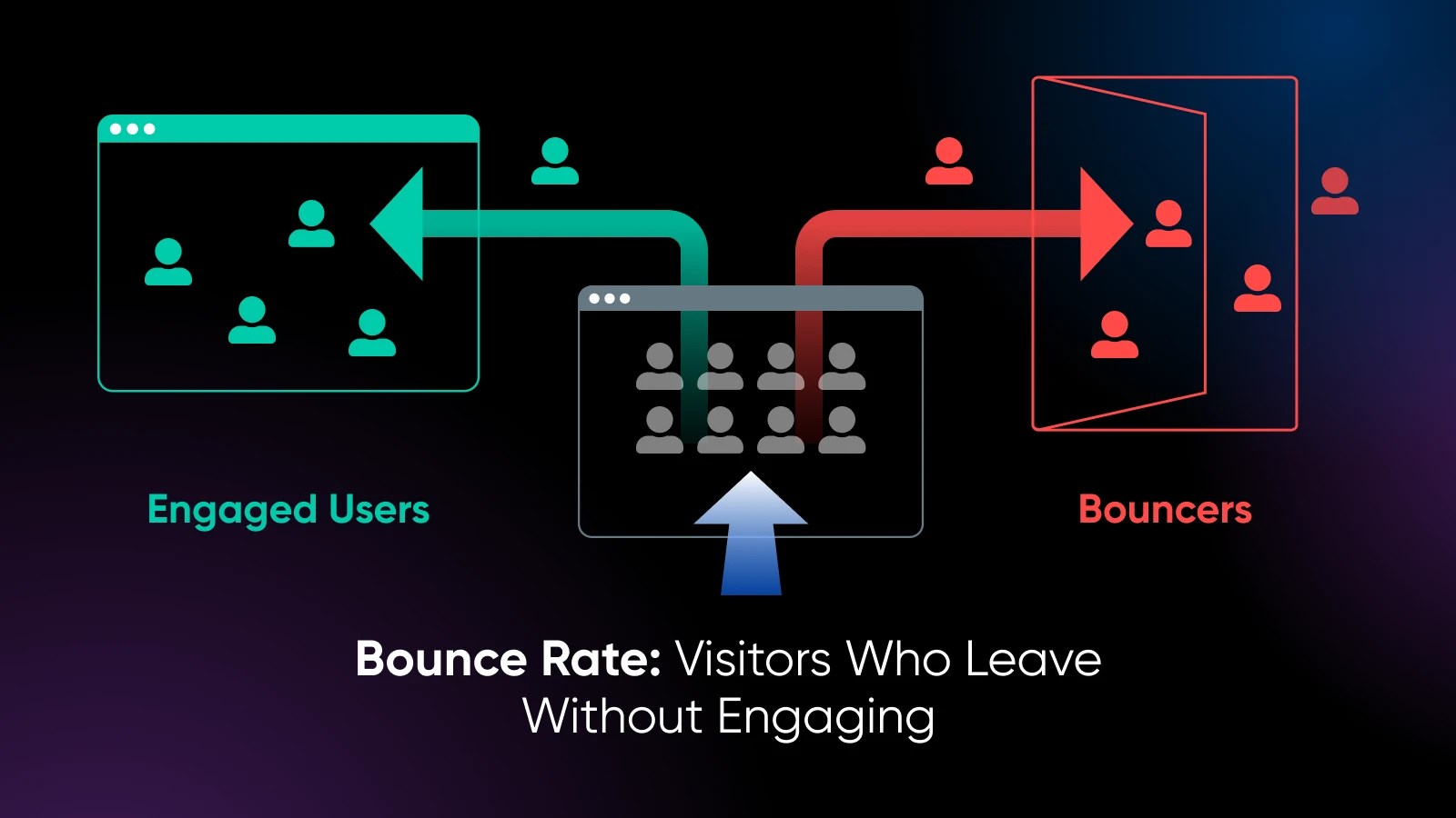
For example, if 100 people visit a product page and 65 leave without clicking anything else, that page has a 65% bounce rate.
However, there’s nuance here. A bounce doesn’t always mean content or a page has failed. For example, say someone searches for a specific question, lands on your blog post, finds their answer, and leaves satisfied. That’s technically a bounce, but not a bad experience.
Your goal shouldn’t be zero bounces; it should be making sure that important pages — like your homepage, landing pages, or pages that significantly contribute to your sales funnel — do their job of guiding people deeper into your site or toward a conversion.
Understanding bounce rate gives you insight into what’s working, what’s not, and where you might be losing people. And once you know that, you can start fixing potential issues to boost engagement and conversions.
How To Check Your Bounce Rate
Tracking your bounce rate starts with the right tools. Two popular, beginner-friendly options are Google Analytics 4 (GA4) and Google’s Site Kit plugin for WordPress.
Using GA4
GA4 doesn’t display bounce rate by default. Instead, it shows you a metric it calls “engagement rate,” which is the inverse of bounce rate. But your bounce rate is still available; you just have to enable it manually.
Here’s what to do:
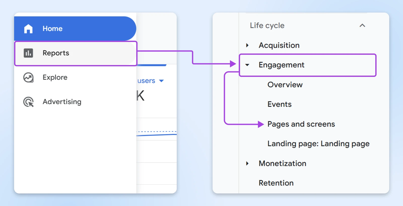
Log in to your Google account.
Select your website property.
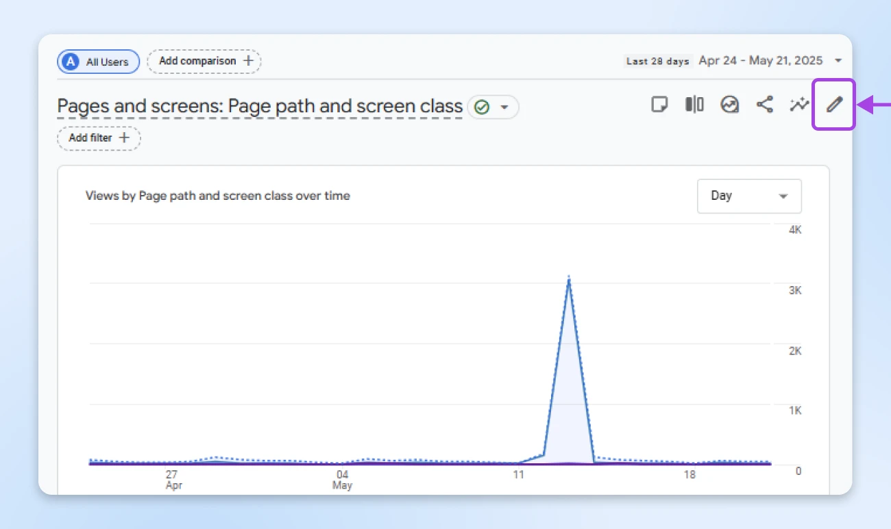
On the left sidebar, go to Reports > Engagement > Pages and screens.
Click the pencil icon in the top right corner of the report (Note: You can only customize a report if you are an Editor or Administrator. If you don’t see the pencil icon, you don’t have an Editor or Administrator role).
In the customization panel on the right, click Metrics.
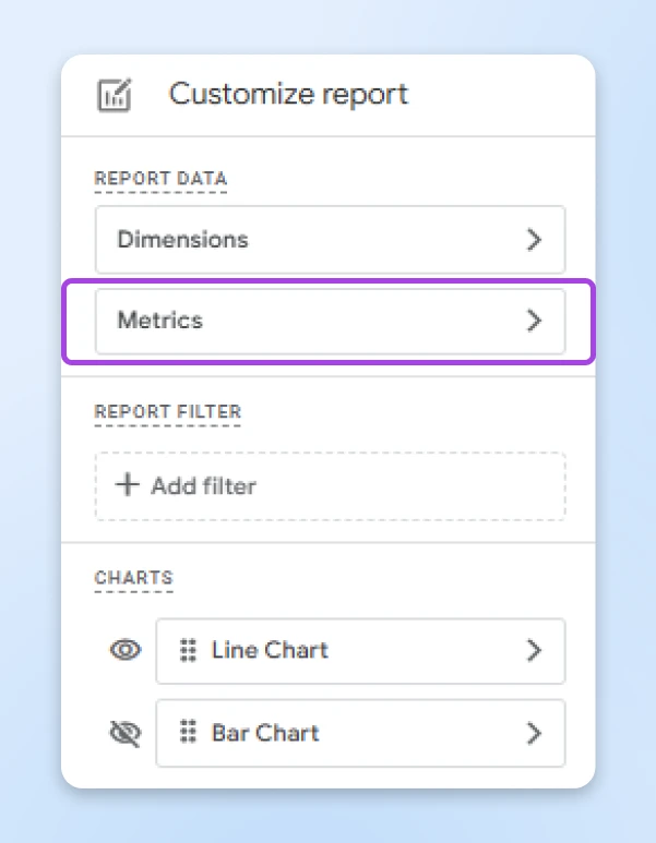
Search for Bounce rate, add it to your visible metrics, and hit Apply.
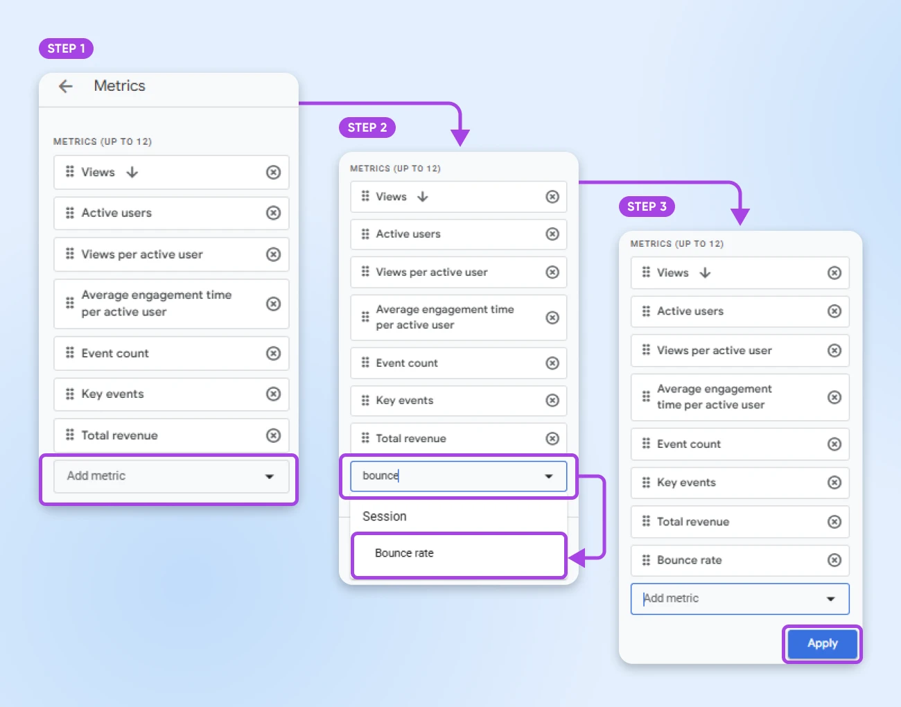
Save your changes by clicking Apply.
Now you can track bounce rate alongside other performance metrics.
Using Site Kit (for WordPress Users)
If you’re running a WordPress site and want a simpler, more visual solution, Site Kit can be an option. Note that it doesn’t directly display bounce rates, but there are a few ways to infer them from other metrics.
Here’s what to do:
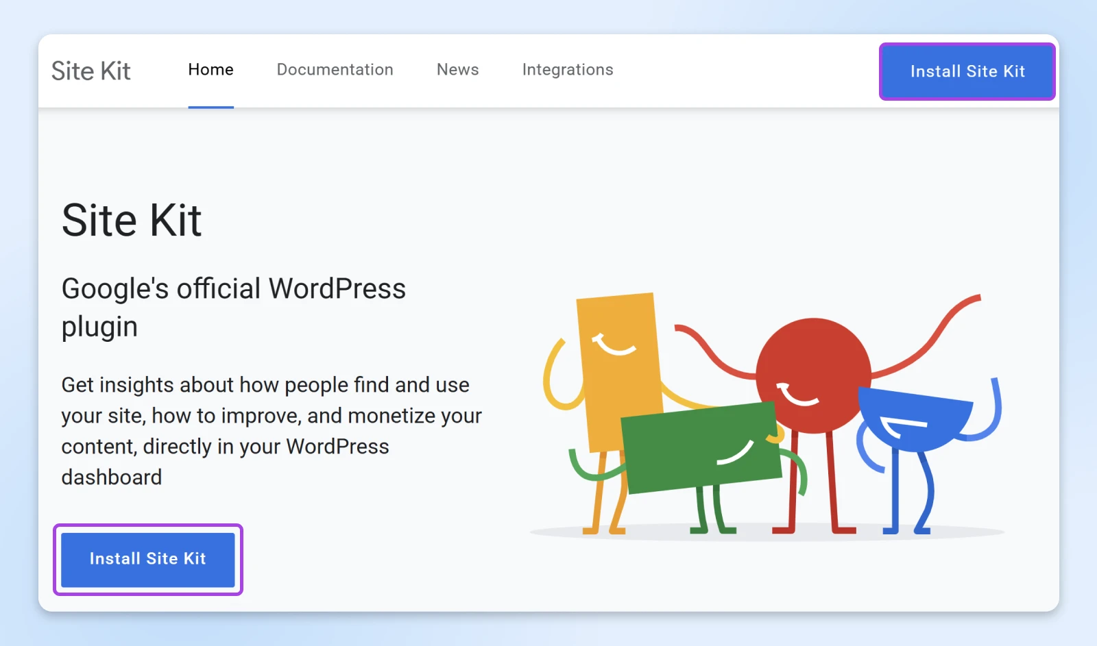
Once you’re in the Key Metrics tab, you’ll see a tile called Least Engaging Pages. It uses the bounce rate metric (along with screen page views) from GA4 to calculate the least engaging pages on your site.
Another way to approximate bounce rate in Site Kit is to check the Content section and look for Engagement Rate by page. In GA4, engagement rate is the inverse of bounce rate. So you could approximate bounce rate by subtracting engagement rate from 100.
What’s a ‘Good’ Bounce Rate?
There’s no single bounce rate that every site owner should strive for. What counts as good depends heavily on your site type, content, industry, audience behavior, and tons of other factors.
That said, industry benchmarks help you understand what’s normal and what’s not. Here are some general guidelines to give you a starting point, but you’ll likely want to research some more specific benchmarks for your industry:
- Under 20%: Something is wrong with your analytics
- 20–40%: Excellent (usually seen on service sites or product-focused pages with clear next steps)
- 41–55%: Average
- 56–70%: Higher than average, may need improvement
- 70%+: Potential red flag, especially if these are landing or conversion-focused pages
A few things to pay attention to as you explore your baselines:
- Which pages have the highest bounce rates? These are the first pages you should consider for optimization targets.
- How does bounce rate vary by traffic source? For example, people coming from organic search may behave differently than those from paid ads.
- What’s the average time on page for high-bounce pages? This can help you distinguish between “bad” bounces versus “I got what I came for” visitors.
Also, keep in mind:
- Blogs and content-heavy pages tend to have higher bounce rates (especially if users find what they need quickly and leave).
- E-commerce product pages often have lower bounce rates because users click around to browse or compare.
- Campaign landing pages should aim for the lowest bounce rates, since you want users to take action.
But remember that bounce rate is just one metric, a single piece of a larger puzzle. Combine it with average engagement time, scroll depth, and conversion rate to get a fuller picture of what’s really happening on your site.
10 Strategies To Reduce Bounce Rate
Now that we have visibility on bounce rate, how do we improve it? Here are 10 proven ways to reduce bounce rates and keep visitors engaged on your site.
1. Match Visitor Intent
Bounce rate goes up when there’s a mismatch between what a visitor expects and what they find. For example, if you place an ad that promises “handmade candles under $10,” but your landing page sells luxury gift boxes starting at $60, you’re setting yourself (and potential customers) up for disappointment.
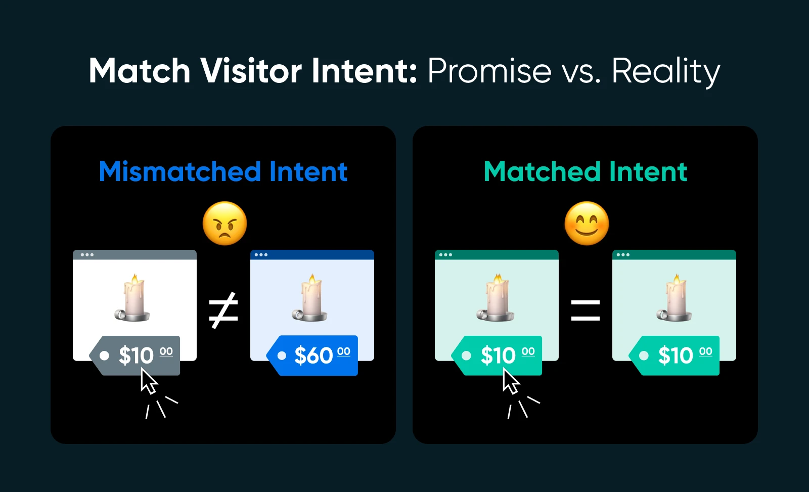
The bottom line: When your content meets visitors right where they are — answering their questions, acknowledging their pain points, or delivering exactly what they clicked for — you dramatically improve the chances they’ll stick around.
What to do:
- Start by reviewing your top traffic sources (organic, paid, social, etc.) and examining what people search for or click on.
- Make sure your page content reflects the language and expectations set in your search result, ad, or email. Headlines, subheads, and above-the-fold content should align precisely with the promise made before the click.
- Use heatmaps or user session tools like Contentsquare to see where people stop engaging.
2. Make Sure Visitors Know They’re in the Right Place
Visitors should immediately feel oriented. In five seconds or less, they should understand who you are, what you offer, and what they should do next. If it’s not immediately clear, they may make a fast exit.
The bottom line: Your above-the-fold content should do three things: Say what the page is about, show what the visitor can do next, and reassure them that your site is trustworthy and relevant.
What to do:
- Craft a clear, concise headline that communicates what your page is about in plain language. Think “Get a Free Website Audit Today” instead of “Digital Experience Enhancement Solutions.”
- Use subheadings to reinforce the value of the page. A good subhead anticipates a visitor’s next question.
- Support your copy with imagery that reflects your audience or offering. A photo of your actual product or team builds more trust than a generic stock photo.
- Add visual trust signals like ratings, testimonials, and logos of publications or customers, especially if you’re asking for something in return.
3. Improve Internal Navigation
When your site structure is confusing, people leave —not because they’re uninterested, but because they can’t find what they’re looking for. Your navigation and menu design should act like a helpful tour guide, not a choose-your-own-adventure gone wrong.
This example shows how Give Me Glow provides consistency in their menu by categorizing and using arrows to indicate drop-downs for additional menus.

The bottom line: Improved navigation encourages exploration, lowers friction, and helps guide people to the answers, products, or information they’re looking for.
What to do:
- Keep top-level menus short and intuitive. Group related items under logical categories (e.g., “Products,” “About,” “Support”) and avoid clever-but-confusing labels like “Solutions Hub.”
- Add contextual internal links within your content. For example, if you mention WordPress in a blog post, provide a link to your WordPress hosting page.
- Use sidebar menus, breadcrumbs, or sticky nav bars on longer pages so users can easily move around.
- Make sure your navigation is mobile-friendly and doesn’t rely solely on hover-based dropdowns.
4. Add Strong Calls to Action (CTAs)
Bounce rates often spike when visitors aren’t sure what to do next. So if your visitors aren’t taking the next step, it might be because you’re not telling them what it is. A CTA is your chance to guide people toward something meaningful, whether that’s a sign-up, a sale, or just reading the next blog post. Ask yourself, what do you want this visitor to do next? Then make that option clear, compelling, and easy to act on.
The bottom line: A good CTA respects the user journey and provides a logical, low-friction next step that feels natural, not pushy.
What to do:
- Use active, specific language. “Download the free guide,” “Start your 14-day trial,” or “Explore pricing” are much more effective than “Learn more.”
- Match the CTA with the page’s purpose. On an informational page, a “Read next” CTA works better than a sales pitch. On a product page, “Add to Cart” or “View Plans” is more appropriate.
- Design your CTA to stand out visually without overwhelming the rest of the page.
- Place CTAs strategically throughout the page, not just at the end. Heatmaps and A/B testing can help you find the most effective spots. Consider adding sticky CTAs or buttons that appear after someone scrolls 50% down.
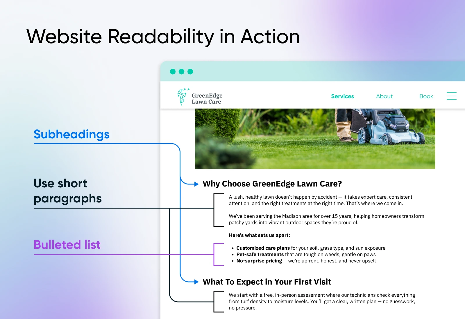
5. Make Your Content More Readable
Your content might be brilliant,but if it’s hard to read (for example, buried in dense paragraphs with no visual breaks or lacking in accessibility features), most people won’t stick around to read it.
Visitors tend to scan rather than read word-for-word, so formatting and structure are just as important as the writing itself. Clear, skimmable content helps users find the info they’re looking for faster,reducing frustration and (you guessed it) bounce rates.
The bottom line: Improving readability helps people engage with your content, keeping them on the page longer and reducing bounce.
What to do:
- Use short paragraphs (2–4 lines max). Big walls of text are intimidating, especially on mobile.
- Break up your content with subheadings every 200–300 words to help guide readers through the page.
- Use bold text, lists, and callout boxes to highlight key information.
- Aim for an 8th-grade reading level. Tools like Hemingway and Grammarly can help simplify dense writing.
- Don’t forget font size and line spacing. At least 16px with adequate spacing makes content easier on the eyes.
6. Include Eye-Catching Visuals
Your audience forms a first impression of your website in just a few seconds,and visuals play a massive role in how that impression is shaped.
Those images, videos, graphics, and icons aren’t just for decoration. They’re tools to communicate information, capture attention, break up text, and reinforce your message.
Strategic visuals help your page feel more engaging and easier to digest, encouraging users to scroll instead of bounce.
The bottom line: Don’t add images for the sake of filling space, but use them to reinforce your message and guide the reader’s eye through the page. Done right, visuals reduce bounce rate by making your site feel more approachable and easier to engage with.
What to do:
- Use high-quality, relevant images that support the content. Avoid generic stock photos when possible. Images that reflect your brand, product, or team build more trust.
- Incorporate screenshots, product photos, or step-by-step visuals to explain complex processes or software.
- Use infographics to visualize data, comparisons, or frameworks. These are great for increasing time-on-page and shareability.
- Include videos (embedded responsibly so they don’t slow load times) to explain your product, demo a feature, or share testimonials.
- Write informative captions for your images. Captions are among the most-read text on a page and can enhance understanding.
- Always use descriptive alt text to support accessibility and SEO.
7. Improve Content Quality
You can dress a webpage up with fast loading times, sleek navigation, and beautiful visuals, but readers will still bounce if the content isn’t useful. Think about content as a conversation with your ideal customer. Would they walk away from that conversation feeling like you helped them, or that you just rambled without offering anything useful? Great content reduces bounce because it proves you’re worth listening to.
The bottom line: Content quality is the backbone of user experience. It’s how you earn trust, provide value, and compel visitors to explore more.
What to do:
- Write with your target audience in mind. Use the language they use, answer the questions they ask, and speak to their needs, not just your features.
- Define a clear purpose for each piece of content. Is it to inform, convert, entertain, or guide? Structure it around that goal.
- Go deep. Fluffy content filled with vague generalities won’t keep people engaged. Use specific examples, actionable advice, stats, quotes, and real insights.
- Avoid keyword stuffing and awkward SEO writing. Write naturally for humans first.
- Keep content up to date. Outdated posts can lead users to distrust your brand. Set a calendar to revisit top posts regularly.
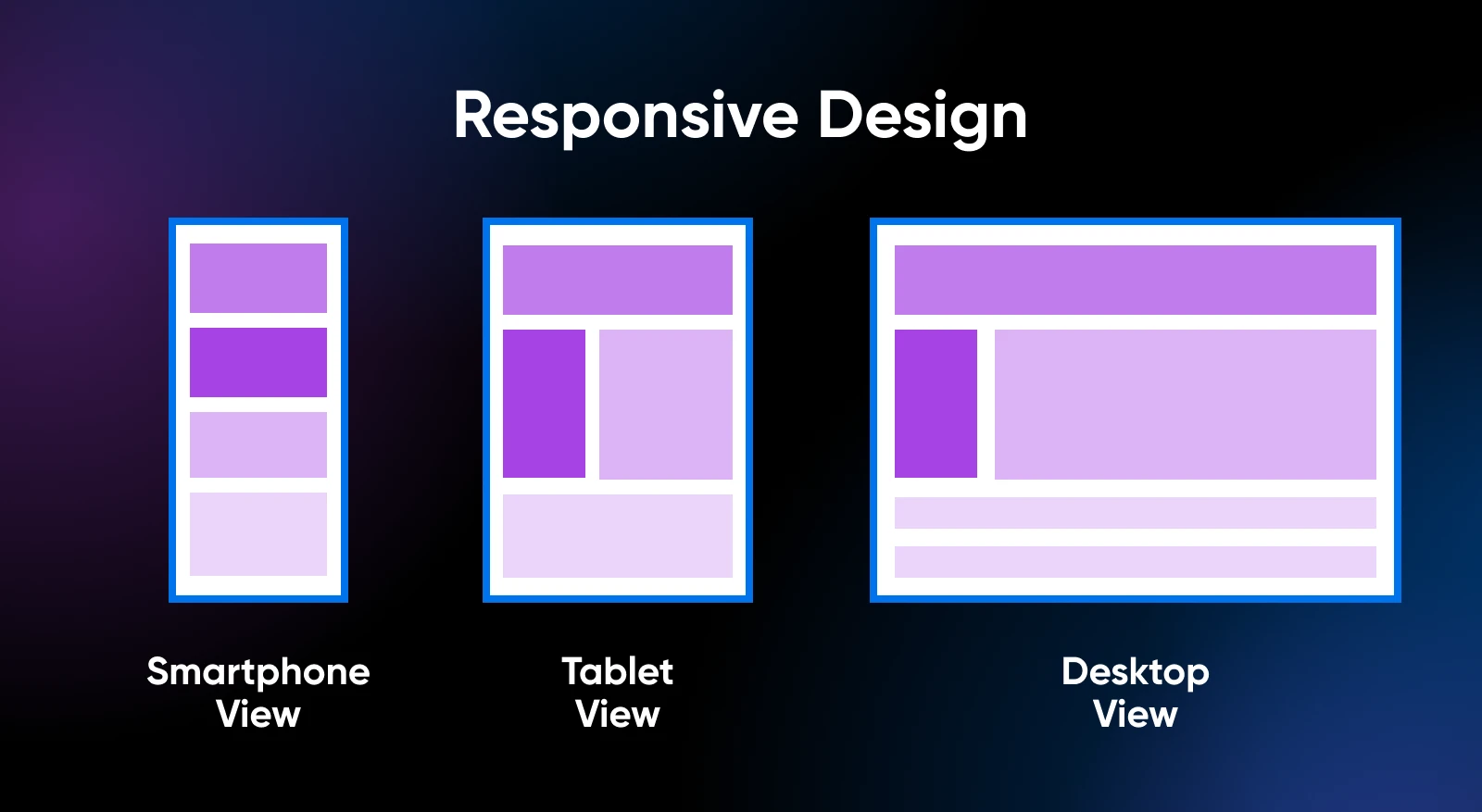
8. Optimize for Mobile
If your website doesn’t work well on smartphones and other mobile devices, you’re turning away the majority of your traffic. According to Statista, more than 60% of global web traffic comes from mobile devices. A site that’s difficult to use on mobile —think too-small fonts, broken layouts, or buttons too small to tap — will push users away before they even give your content a chance.
The bottom line: Even small mobile experience frustrations can lead to big bounce problems, so prioritize your mobile visitors by giving them a fast, frictionless experience that matches or exceeds what they’d get on desktop.
What to do:
- Choose a responsive design that automatically adjusts to different screen sizes. Most modern themes for WordPress and other platforms are responsive by default.
- Test every important page on your smartphone. Don’t just check if it loads. Instead, check if it’s readable, clickable, and usable.
- Make sure fonts are large enough (at least 16px) and line spacing isn’t cramped.
- Use large, clearly defined buttons and tap targets. Nobody wants to pinch-zoom just to click “Buy Now.”
- Optimize images and videos for mobile so they load quickly and don’t break the layout.
9. Improve Page Load Speed
Every second counts. Literally. According to Google, 53% of mobile users abandon a site that takes longer than three seconds to load. It doesn’t matter how good your content is — if your page loads slowly, most people won’t stick around to see it.
The bottom line: A faster website means happier visitors and fewer bounces.
What to do:
- Test your site with Google PageSpeed Insights or GTmetrix, and aim for a load time under three seconds.
- Compress images before uploading using tools like TinyPNG or Squoosh. Large image files are one of the top causes of slow load times.
- Use a content delivery network (CDN) to serve static files from servers closer to your users.
- Minify your site’s CSS, JavaScript, and HTML to eliminate unnecessary code.
- Upgrade your hosting if needed. Shared hosting can struggle under traffic surges; VPS or managed WordPress hosting from DreamHost can dramatically improve load times.
10. Always Be Testing
Every website is different. What works for one audience might flop for another. The only way to know what truly resonates is to test it. Ongoing testing helps you continuously refine your site’s performance and reduce friction at every step.
The bottom line: A/B testing helps you make decisions based on evidence, not assumptions.
What to do:
- Start by identifying one element to test: a headline, CTA button, hero image, or page layout.
- Use tools like Convert or Optimizely to run A/B tests and measure results.
- Apply learnings from one page across other similar pages.
Give Visitors What They Came For
From aligning your content with visitor intent to improving readability, navigation, and page speed, every tip in this guide is designed to help you create a smoother, smarter experience. Bounce rate may seem like just another number in your analytics dashboard, but behind that number are real people trying to decide if your site is worth their time.
The takeaway? Don’t chase lower bounce rates for the sake of vanity metrics. Focus on delivering what your audience needs, clearly, quickly, and consistently. The better your site serves your visitors, the more time they’ll spend with you.
And if you want a fast, reliable, and flexible hosting setup that can support all these strategies, check out managed WordPress hosting from DreamHost to build a better-performing website that keeps visitors coming back for more.

Pro Services – Marketing
Get More Visitors,u2028 Grow Your Business
Our marketing experts will help you earn more traffic and convert more website visitors so you can focus on running your business.
See More
Did you enjoy this article?