How To Build Your Own Custom Google Analytics Dashboard

Digging out all the important website data from Google Analytics 4 can be challenging if you don’t know what to look for or how to navigate the platform. Thankfully, new, custom, or external GA4 dashboards might be the exact solution you’ve been searching for.
Here’s how to cut through the noise and optimize your site around the most relevant web metrics effortlessly.
What Is a Google Analytics 4 Dashboard?
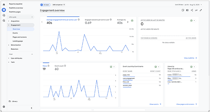
A Google Analytics 4 dashboard organizes your key website metrics and KPIs into a single, easily digestible view.
It helps you understand where visitors are coming from, analyze traffic channels, improve underperforming pages, A/B test page variants, and create strategies to build your online presence. You can either use real-time data widgets or historical data with charts, maps, and pie graphs.

There are three general types of GA4 dashboards:
In GA4, Dashboards, Reports, and Explorations are mostly synonymous, with Explorations offering a more in-depth data analysis than the other two.
How to Create a Google Analytics 4 Dashboard (Step-by-Step)
Here’s how to create a new exploration, which essentially serves as a dashboard equivalent in GA4:
1. Sign in to your GA4 account.
2. Select your preferred property.
3. Navigate to Explore from the left-hand menu.
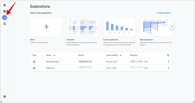
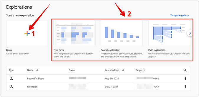
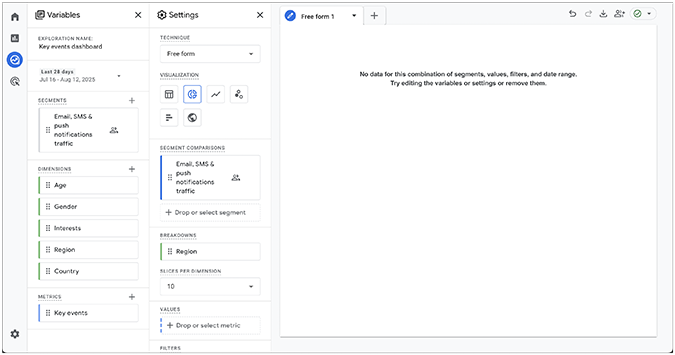
4. Click the plus icon to create a blank exploration, or choose one from the available templates. According to the latest Google guidelines, explorations support the following visual formats and techniques:
- Free-form exploration—Shows data in a crosstab layout, including options such as line charts, pie charts, bar charts, scatter plots, and geo maps.
- Cohort exploration—Creates groups of users who share common attributes.
- Funnel exploration—Tracks the steps users take to complete a desired action on your website or app.
- Segment overlap—Uses Venn diagrams to show commonalities between different user groups.
- User explorer—Creates a comprehensive report of user segments and individual users.
- Path exploration—Visualizes how users navigate through your site’s pages.
- User lifetime—Analyzes user actions throughout their entire lifetime as your customers.
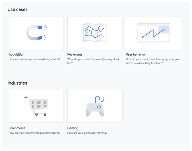
5. In addition to these techniques, the Template Gallery also lets you pick a Use Case template (e.g., Acquisition, Key Events, User Behavior) or an Industries template (e.g., Ecommerce, Gaming).
6. In the Variables section, pick your preferred Metrics and Dimensions. You can apply up to 20 filters and 20 segments per exploration to further refine your data.
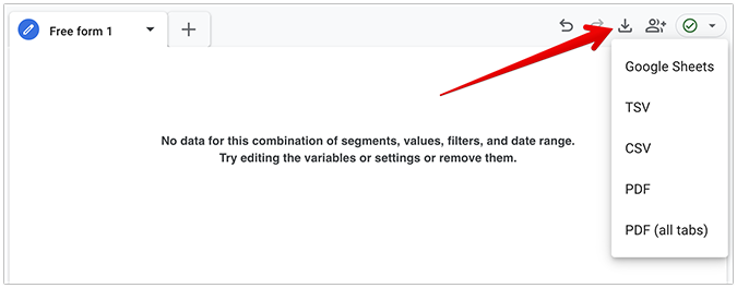
7. Once you’re done customizing, click the down arrow in the top-right corner to export your exploration. Google Analytics 4 supports the following export formats: Google Sheets, TSV, CSV, and PDF.
Best Google Analytics 4 Dashboard Templates (Free & Paid)
Here’s a quick roundup of the best GA4 dashboard templates available today, along with why they’re good and tips for using them effectively.
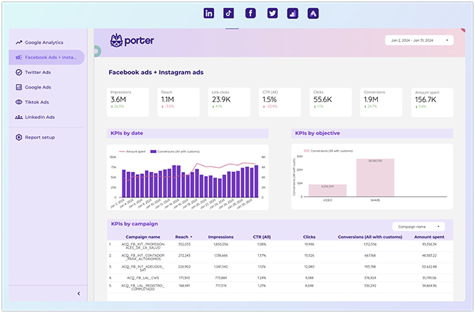
1. Paid Media Dashboard Template by Portermetrics.com
Pricing: $12.5/month for a single connected account.
The Paid Media Dashboard Template, courtesy of Portermetrics.com, provides marketers with a detailed campaign overview across major platforms such as Google Ads, Facebook Ads, TikTok Ads, and LinkedIn Ads. It seamlessly integrates GA4 data (including paid media metrics), enabling users to monitor clicks, impressions, conversion rates, click-through rates (CTR), and ad spend efficiency in a single hub.
The dashboard template is simple to connect to your other paid media accounts. Simply head on over to the official template page and follow the step-by-step instructions provided by the Porter team. You can also download your reports as PDFs by selecting the desired date range and choosing the specific report pages you want to save to your device.
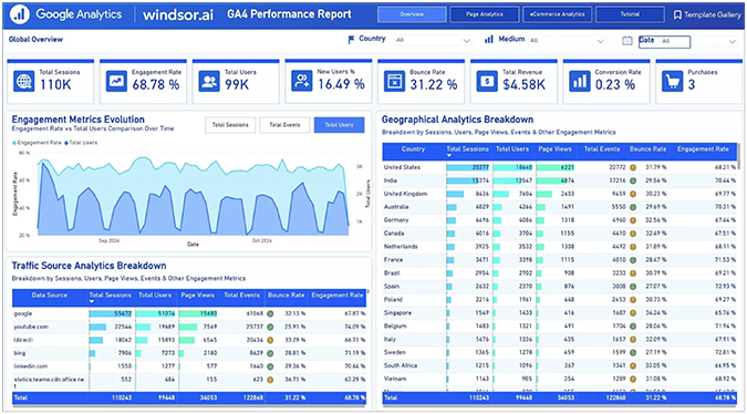
2. Google Analytics 4 (GA4) Dashboard Template on Power BI by Windsor.ai
Pricing:
- Free for a single user and supporting up to three data sources.
- Professional tier priced at $499/month, supporting up to 14 data sources and 500 accounts.
This template perfectly encapsulates a modern GA4 dashboard for Power BI (Microsoft’s data analytics and visualization platform), offering strong, robust visualization capabilities in a clear, easy-to-comprehend arrangement. Users get access to key metrics such as engagement rates, traffic sources, and conversion funnels, all sourced with real data syncing through Windsor.ai’s proprietary connector. The user interface is intuitive and easy to navigate, distilling complex GA4 data into digestible visual chunks.
In theory, the template is free. For larger websites, however, you’ll likely need to create an account and subscribe to one of the available paid plans. Otherwise, you might find yourself missing out on critical information during the data population phase while connecting your GA4 and Power BI accounts.
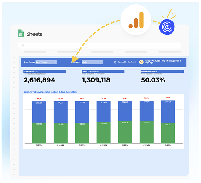
3. Website Conversions Report by Coefficient.com
Pricing:
- Free for a single user, supporting up to three data sources, a 5,000-row import size limit, and a 100-row export size limit.
- Pro tier priced at $99/month, supporting up to six data sources with unlimited import and export sheet sizes.
Coefficient’s Website Conversion Report is a simple, straightforward, and modern GA4-compatible dashboard that links all your live data to Google Sheets and Excel via the platform’s trademark Connected Spreadsheets. It offers marketers lightning-fast accuracy with zero code, without the steep learning curve found in less-refined templates. You can also customize your metrics to best fit your needs, making it an excellent choice for both small businesses and mid-level organizations.
To download the template, go to Coefficient’s official page, click Get Free Template, enter your email, and select Use Template. Next, connect your Google Workspace, GA4, or Microsoft account, and pick between automatically or manually connecting your live data. While the dashboard itself is free, there’s a limited number of sheet export sizes, so large companies should consider purchasing one of the paid plans to unlock its full range of capabilities.
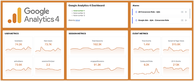
4. Google Analytics 4 Dashboard Template for Marketers by Adriel.com
Pricing:
- Beginner tier priced at $500/month, featuring up to five users, five dashboards, and support for more than 25 ad accounts.
- Access to the Professional tier costs $1,500/month and includes up to 20 users, unlimited dashboards, and supports more than 100 ad accounts.
Adriel’s primary goal is to reduce the unnecessary complexity of GA4 reports into a single, convenient, and beginner-friendly platform. The Google Analytics 4 Dashboard Template for Marketers offers an intuitive drag-and-drop builder that lets you visualize key metrics, including user engagement, traffic sources, and campaign goals, across multiple platforms without having to wrestle with learning a complicated setup. Each individual element is fully customizable, ensuring the data output matches the needs of the intended stakeholders.
Adriel’s ready-made GA4 dashboards are ideal if you plan to create specific views for different client groups or internal teams. For example, you can spin up a conversion-focused view for the marketing department, a paid social media view for the social media team, and a detailed web analytics view for the C-suite team—all within a single template. The only drawback is that accessing Adriel’s GA4 templates requires a minimum subscription of $500 per month.
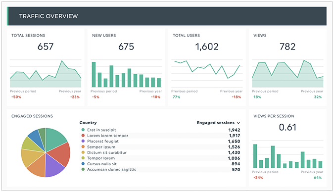
5. GA4 Report Template by Dashthis.com
Pricing:
- You can try out the company’s 15-day free trial, which unlocks access for up to 10 dashboards in total.
- Paid plans start with the Individual tier at $42/month and go all the way up to the Standard tier at $409/month.
The GA4 Report Template by DashThis is crafted with multi-channel analytics in mind, allowing a seamless KPI aggregation with just a few clicks and no coding knowledge required. It offers rich visualization options (pie graphs, gauge charts, stacked column lists), flexible widgets, and robust white label branding features. DashThis’s template also smoothly integrates with major digital analytics platforms such as Moz, Ahrefs, and Semrush.
This environment excels in its updating and sharing capabilities, offering automatic template updates and instant sharing via live links, email, or downloads. Its UI tool is both versatile and fast, while the company’s customer support is helpful and responsive. Unfortunately, the free tier only allows access for 15 days, leaving much to be desired for startups and individuals on a tight budget.
For a complete look at the base GA4 reports, check our Google Analytics 4 Beginner’s Guide.
Google Analytics 4 (GA4) Dashboards: What’s Different?
Google Analytics 4 and Universal Analytics dashboards look and operate fairly similarly on the surface, but there are still some nuanced differences between the two that set them apart. With that said, since UA has already been permanently sunset, it’s literally impossible to access its dashboards—even if you wanted to.
These have been the key differences between UA and GA4 (dashboard- and reporting-wise) while UA was still around:
Tips and Tricks to Get the Most Out of Your Dashboards
Google Analytics 4 can be a confusing environment if you’re brand-new to the platform or if you’re trying to juggle multiple incompatible metrics at once—such as tracking social media spend, recording all possible browser versions, or digging into average engagement time without applying the proper context.
Here are a handful of useful tips to help optimize your GA4 reporting workflow without losing focus.
Pick a popular and highly-rated dashboard template
Just because something is popular doesn’t always mean it’s of good quality. In this case, however, it actually does. In digital marketing, users often flock toward top-rated themes from trustworthy developers and proven brands, minimizing the risks before making a costly long-term commitment to a specific SaaS tool.
Some dashboard-hosting platforms have a significant presence on software review sites like Getapp or Capterra. Check the brand for positive customer reviews, then search for a specific dashboard template you like and see what people are saying about it, including constructive feedback. If it’s rated highly by a large chunk of its user base, go for it. If not, there’s likely a good reason why.
In summary, choose popular, highly-rated, and prominently-reviewed dashboard templates, and try avoiding obscure templates with little to no reviews, low user scores, or unknown creators.
Identify your business’s key events
In GA4, any event can become a key event, but that doesn’t mean that it should be. Key events are critical actions users undergo on your site that drive results, such as buying a product, downloading a lead magnet, or submitting contact information. Depending on your niche and goals, consider setting up these events as key events, making them easier to track moving forward. Here’s how.
First, navigate to Admin, Events.
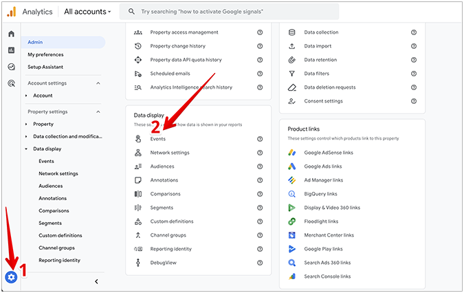
Next, click the star in front of the event you want to choose as your key event.
Be very selective with your choices, and don’t hesitate to remove a key event if it doesn’t prove important for your business goals.
Review your dashboards regularly
GA4 dashboards only work if you check them regularly and adjust based on user actions from the past period. Consider reviewing them weekly and performing an in-depth analysis on the most impactful metrics identified in the previous step of your data monitoring workflow.
This is important for several reasons. First, it gives you the opportunity to notice trends early on and act while the proverbial iron is still hot. For instance, you might see a sudden uptick in cart abandonment rate. Or, you might notice that your popular pages are receiving less traffic than usual, a discovery that may warrant a technical site analysis. Or, you might notice a discrepancy between your Google Search Console (GSC) data and GA4 data, providing an opportunity to fix any syncing errors and prevent even bigger issues down the road.
Automate alerts
Consider setting up alerts to automatically send reports at regular intervals to all relevant stakeholders. In GA4, you can create alerts via the Insights feature.
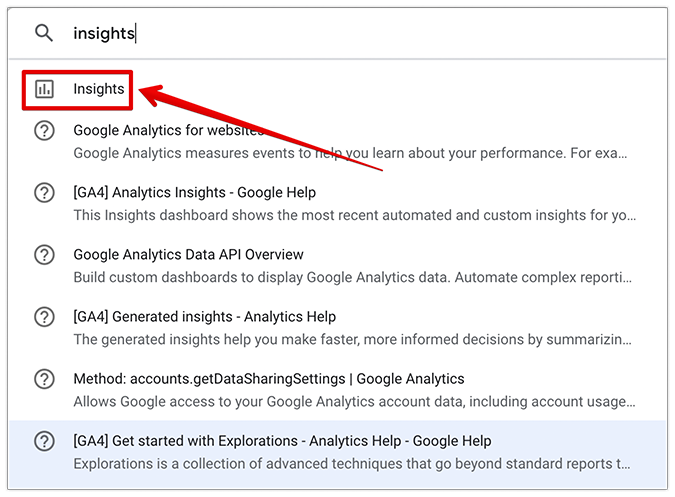
First, type “insights” in the GA4 search bar and select the matching result.
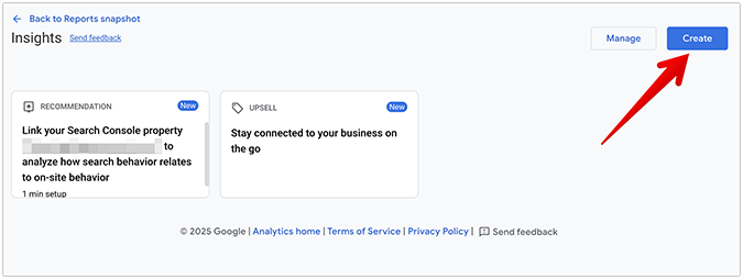
Then, click Create to create a new insight.
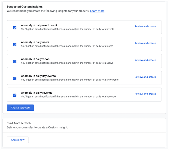
You can either choose from GA4’s existing insights or create a custom insight from scratch.
Uplevel Your Dashboards with Looker Studio
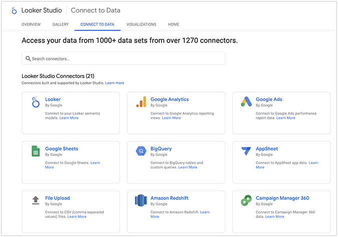
Looker Studio, formerly called Google Data Studio, is a free Google Cloud-hosted tool that enables users to supercharge their static GA4 data into interactive, colorful, and easily digestible dashboards. It integrates seamlessly with most Google products, such as Google Sheets, Google Drive, GA4, BigQuery, YouTube Analytics, MySQL, PostgreSQL, and third-party platforms like Facebook, Amazon Redshift, and Microsoft SQL Server for a streamlined marketing analytics and data management experience.
This full integration removes the need for manual reporting, replacing spreadsheets with real-time, ready-made dashboards that enable faster decision-making when it matters most. Non-technical users can also benefit from Looker Studio by using Google’s extensive connector library with minimal or no coding knowledge.
In other words, Looker Studio makes your Google Analytics 4 reports visually better.
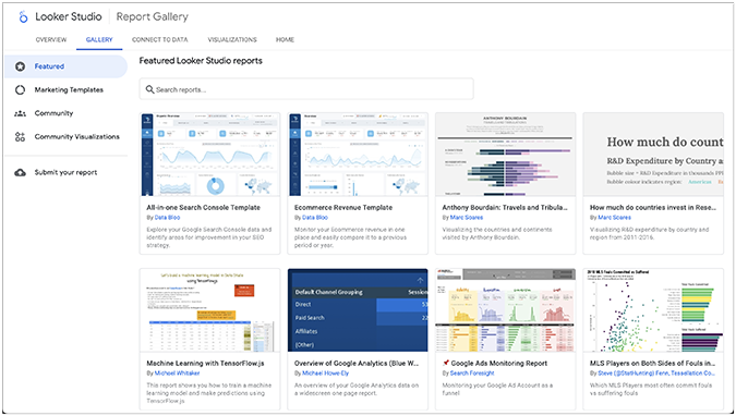
As an end user, you can pick an existing dashboard template that best serves your company’s needs and connect your data for cleaner, more effective reporting.
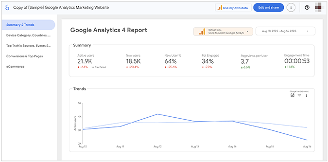
As a creator, you’re provided with the familiar Google Workspace user interface, allowing you to craft a variety of dashboards, such as pie charts, column charts, scorecards, treemaps, and more.
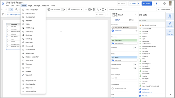
To summarize, if you want a highly detailed, easily scalable, and visually distinct way to uplevel your analytics dashboards, Looker Studio stands out as one of the leading free data visualization platforms in the industry.