Are They Always the Best Choice?


Long-form landing pages are a core component of any marketing, sales, and promotional strategy, acting as a structured blueprint where the combined power of a skilled copywriting and web design team can guide the reader toward making a purchase.
A well-executed long-form landing page can put prospects at ease by addressing most of their objections upfront, while a poorly written one can dissuade even the most dedicated clients away from your brand.
What’s a Long-Form Landing Page?
Long-form landing pages are sales-oriented web pages to sell a product or service using persuasive language, actionable tips, client testimonials, and additional copywriting tactics that showcase the unique value proposition (UVP) in action.
They’re typically structured like an independent sales funnel, guiding prospects through the customer’s journey one section at a time.
This format works surprisingly well for selling complex and expensive products and services, such as comprehensive life insurance packages, highly specialized, enterprise-level software like NetSuite, or high-end goods like performance cars, luxury yachts, and jewelry-adorned designer clothing lines. Any sales page exceeding 1,000 words could be considered a long-form landing page if it’s designed to drive a purchase during the same visit.
Is a Long Copy Landing Page the Same Thing?
Yes. For all intents and purposes, long copy landing pages and long-form landing pages are one and the same.
What about long-form sales pages? Long-form sales pages are similar to long-form landing pages, but they aren’t quite the same. Think about it like this: all long-form landing pages are sales pages; however, not all long-form sales pages graduate to become the first web page visitors see when arriving from an external source, i.e., a landing page.
5 Examples of Long-Form Landing Pages
Modern long-form landing pages have been continuously evolving over time to match the current customer demand. They’ve stopped resembling endless walls of text like this:
…and have started to look like well-designed, thoughtfully composed conversion machines that exist to reassure, guide, and nudge customers into taking action, like this:
Here are five examples of contemporary long-form landing pages that marry the functionality of classic sales letters with the aesthetics, user interface, and conversion formulas of modern web design.
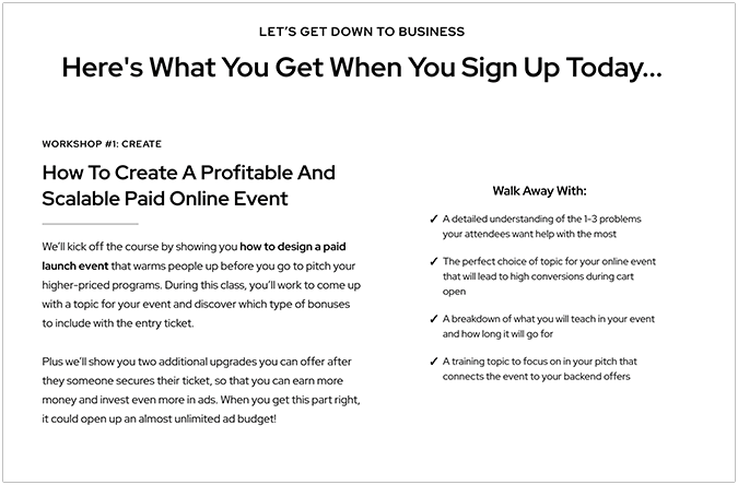
1. Jill and Josh’s Paid Launch Formula
Paid Launch Formula, a course about launching successful products and scaling new or existing businesses, gets everything right when it comes to copy, structure, and web element positioning.
Right from the get-go, visitors are greeted with a captivating headline that makes it hard to look away from the page. The copy draws them in with keywords such as “1000+ students”, “7-figure launches”, and “freebie seekers”, creating a compelling narrative scaffolding that promises adventure and discovery.
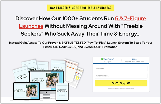
Next, Jill and Josh preemptively address customer objections by framing them as exaggerated versions of the problems many founders have been, and still are, struggling with during product launches. In short, their advice is crystal clear: stop giving out valuable information for free.
After some warm introductions, glowing client testimonials, and an added objection-handling section, the site quickly dives into product value territory by showcasing the expected results if you sign up for the course. The FOMO factor is hard at play, illustrating a glimpse of what’s inside the workshop and what prospects stand to miss if they decide to opt out of the offer.
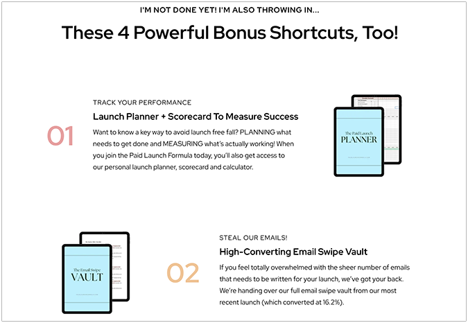
Then comes the classic “wait, but that’s not all” trope strategically placed in the copy, signaling to customers they’re getting more than what they expected from the initial offer. It’s an effective approach that makes prospects say: “I just might get my money’s worth out of this after all. Maybe I should purchase the premium version, add multiple seats, and think about a long-term partnership with this brand.”
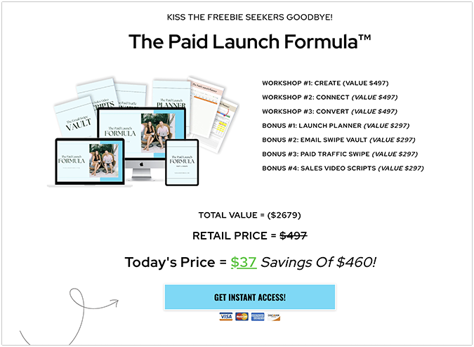
Finally, we arrive at the call-to-action (CTA) section, which illustrates the value in raw numbers and sweetens the deal with a significant discount on the total perceived value of the entire package. The CTA is hard to miss against other web elements on the page, doing its job exactly like it was meant to do.
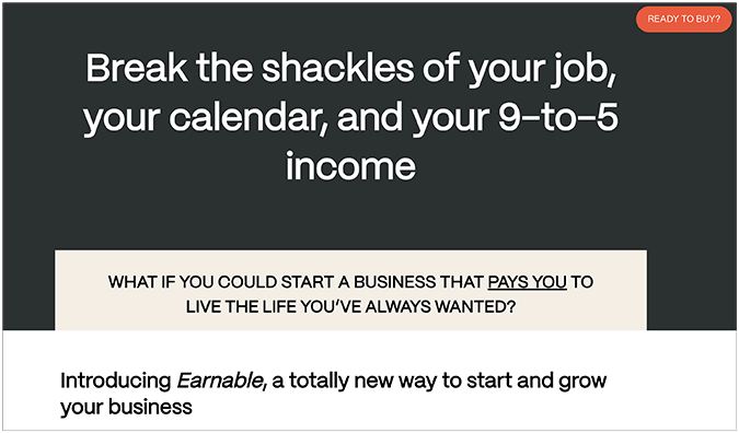
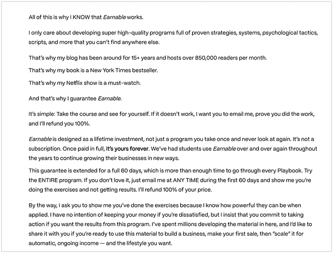
2. Ramit Sethi’s Earnable Course
I Will Teach You To Be Rich’s author Ramit Sethi doesn’t hold back when it comes to marketing his material, and the Earnable course is no exception from this rule. Its long-form landing page is constructed like a slippery slide in true Joe Sugarman style, one you simply can’t take your eyes off. Each section pulls you into the next, ultimately culminating in a powerful call to action that’s hard to resist.
The page opens with a solid headline, promising freedom from the shackles of modern corporate life. Instead, it offers a path of fulfillment, happiness, and complete flexibility to work where and how you want, all neatly wrapped in a single package.
Sethi’s course is unique in several key areas compared to the other entries on this list. First, in addition to the offer in the final section, the site features a sticky CTA that follows readers everywhere as they continue scrolling. Second, it follows a compelling narrative structure, borrowing elements from multiple copywriting frameworks like AIDA (Attention, Interest, Desire, Action), PAS (Problem, Agitation, Solution), and BAB (Before, After, Bridge) to elicit a strong emotional response from readers.
The copy’s tone is simple, down-to-earth, and approachable enough for everyone to understand—regardless of their background. The desirable outcome is constantly emphasized throughout the copy, not through exaggerated claims, but by featuring real numbers from actual campaigns and sales.
Next, Ramit shares his personal story, including his hard work, unforeseen setbacks, and eventual rise to success in pursuit of his dreams. Everything comes across as grounded in reality, adding a level of integrity to Ramit’s journey and encouraging the reader to dig deeper in order to fulfill their dreams.
Around the midpoint, Ramit shares a small nugget of his success formula, one that continues to reverberate through the entirety of the copy, additionally fortified by client testimonials who’ve achieved equal or greater success than what was originally promised in the course.
The customer objections are handled directly and with care.

Lastly, the 100% money-back guarantee seals the deal. However, you have to come clean with Ramit, emailing him proof of your work and why it failed to get the full refund. It’s a classic move straight from Gary Halbert’s playbook, and it does the job with style. Laziness and dishonesty aren’t rewarded in Ramit’s world, acting as a final filter to screen the genuinely interested customers from the uncommitted ones.
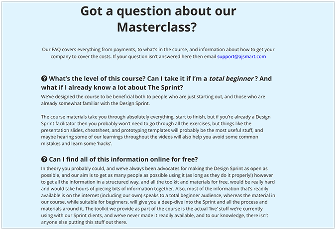
3. AJ & Smart’s Design Sprint Masterclass
Naturally, AJ & Smart’s long-form landing page is the best-looking example compared to the other entries, as expected. It promotes the management side of product design that every aspiring designer should learn, including product design fundamentals like how to assemble the correct design team, how to brainstorm ideas and solve problems effectively, and how to maintain the group’s energy levels during challenging projects.
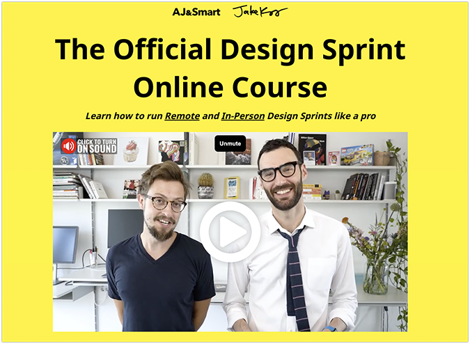
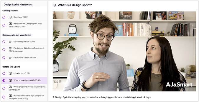
The 5-day design system was developed by former Google employee Jake Knapp, and it was apparently used extensively back in Google HQ to facilitate and streamline product design. It involves product sketching, storyboarding, prototyping, user testing, and much more. The landing page offers a quick glimpse into the full course with just one simple click.
Funnily enough, most of the testimonials are presented as screenshots instead of plain text. This might be a deliberate move to omit them from any unwanted SEO indexing, or a simple oversight by the page’s creators. Either way, it works perfectly fine for now.
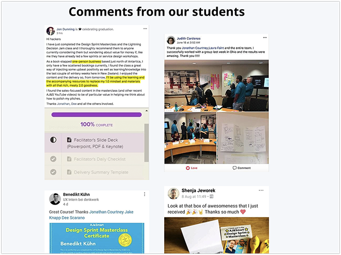
Much like Ramit, customer objections are handled preemptively to slowly and deliberately ease customers into making a purchase.
Lastly, the main CTA section uses clever number trickery, all within reason, for the closing sales pitch. It first displays the perceived original value (€5,000), then shows the discounted price in euros (which is currently stronger than the dollar, making the cost seem lower), and finally it shows the original US dollar price in smaller text—which is the actual amount you’ll pay if you decide to opt into AJ & Smart’s comprehensive design sprint system.

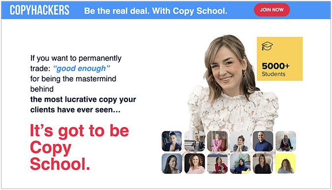
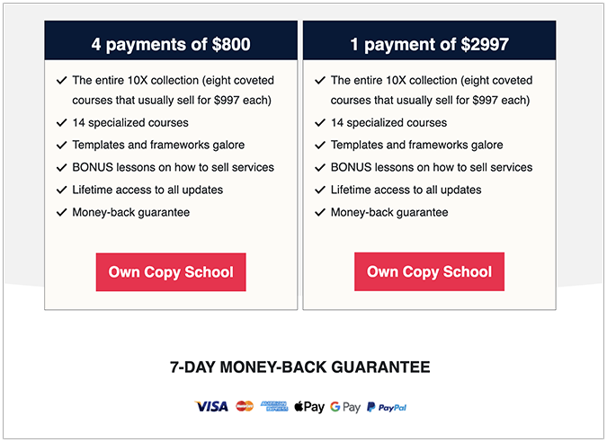
4. Copyhackers’ Copy School
Joanna Wiebe’s latest endeavor pulls out every trick in the book to get people excited about what they’ll learn copywriting-wise—including how to apply it in the real world.
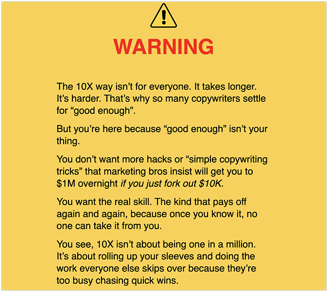
The extra-long landing page (>7,000 words!) doesn’t start with a classic headline, but with a daring promise: “If you want to permanently trade good enough for being the mastermind behind the most lucrative copy your clients have ever seen.” Then, it presents the solution in a bright, red, big-lettered font: “It’s got to be Copy School.”
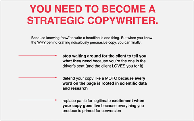
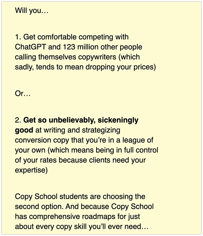
Next, Joanna uses the same tactic to emphasize the critical information prospects should pay special attention to, addressing the pain points with clarity to unearth the hidden worries aspiring copywriters face daily. Her message is simple: whether it’s searching for gigs, communicating with clients, or doing the actual work itself, these hidden fears can lead to self-sabotage if not tackled head-on.
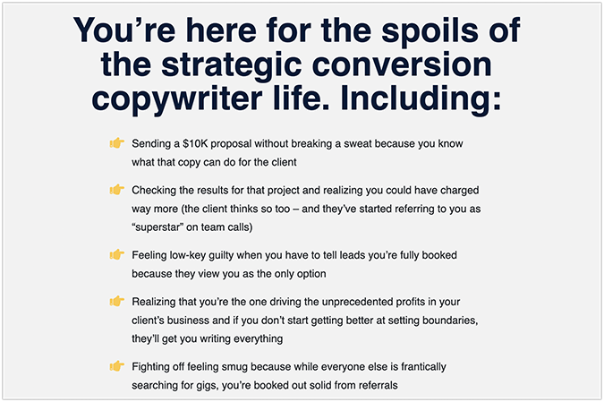
In contrast, here’s what’s in store once prospects overcome the hurdles holding back their true potential.
A simple word of warning helps filter out freeloaders, tire-kickers, and non-serious clients.
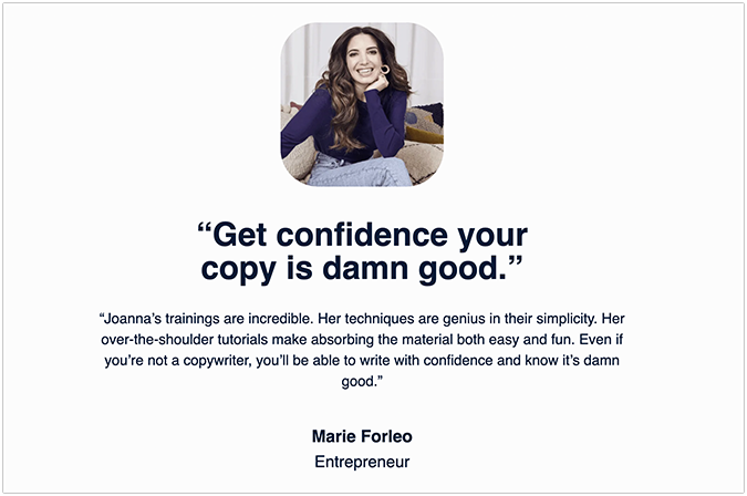
Glowing testimonials from star students further reinforce the validity of the deal, adding credibility, trust, and social integrity to the existing offer.
Then there’s the elephant in the room: generative AI. Joanna strikes a nerve by confronting the real danger that large language models (LLMs) pose to the current and future prospects of aspiring copywriters.
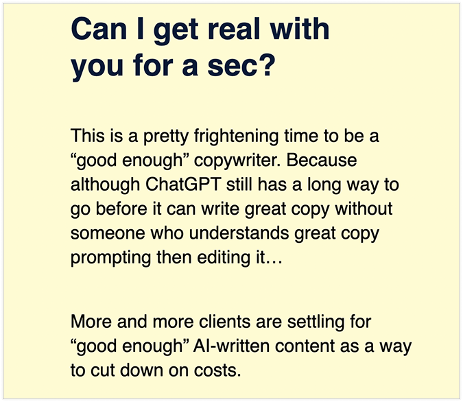
…and immediately follows it up with a hands-on solution that doesn’t outright reject the inevitable future, but rather embraces it with an open mind.
The page closes with a clear CTA, outlining the program’s most important features—plus a 7-day money-back guarantee for the ambivalent Andies thrown in there for good measure.
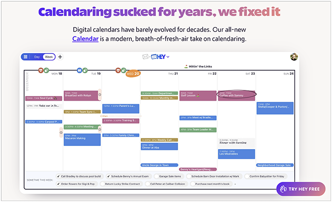
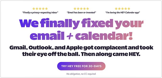
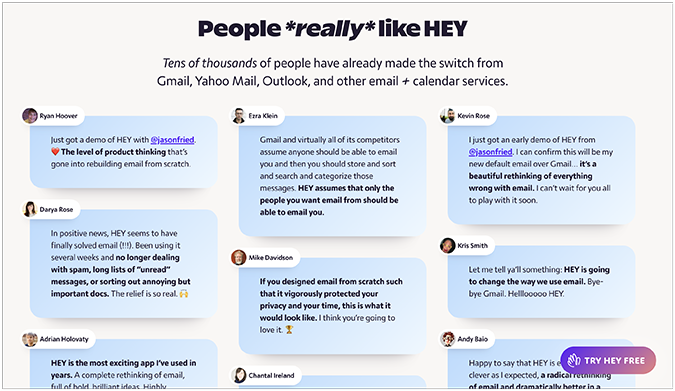
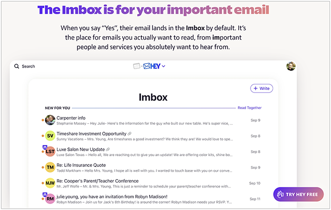
5. 37Signals’ Hey.com
Arguably the most visually appealing entry, 37Signals’ Hey.com is a fresh and novel take on long-form landing pages. The Basecamp creators follow a design-first approach, embedding a significant portion of the copy into images, enhanced screenshots, and keyword clouds instead of using regular text.
Additionally, the client testimonials are fun to look at.
The main benefits of the service are perfectly illustrated through a striking headline, an explanatory subheading, and a high-quality screenshot showcasing its flagship offer—Imbox—in action.
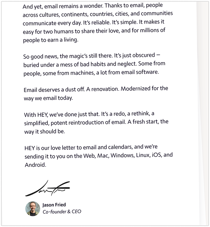
Instead of a standard CTA, the page wraps up with a personal letter from 37Signals cofounder Jason Fried. Following its Hey.com design philosophy, 37Signals is redefining the landing pages of the future in real time.

Do Long Form Copy Landing Pages Always Convert Better?
No, they don’t. While copy length has some impact on conversion rate optimization (CRO), its effectiveness is highly dependent on the context, industry, product or service, brand reputation, target demographic, and existing market trends. As much as we hate to admit it, the long-form sales tactics that worked for Gary Halbert, Joe Sugarman, and David Ogilvy in the past might not work as effectively today—at least not without applying the necessary changes to reflect the evolving customer demand.
The rule “Make the copy as long as it needs to be and no longer” works perfectly in this context. For instance, you can use as much copy as necessary to get visitors authentically excited about your new product or service, pushing them organically through the buyer’s journey based on past conversion data.
If they’ve already been pre-sold elsewhere in the funnel, like through a different product from the same brand, you can keep the copy short and to the point. These customers already know what they want and will eventually convert again—even without the extra information usually found on long-form landing pages.
On the flip side, if you’re hearing (and seeing) crickets traffic-wise, you’ll need much more copy to drive any meaningful conversions across your sales channels. The key is to consider the entire funnel and identify exactly where your landing page sits in it to achieve the best outcome.
How to Build a Long-Form Landing Page
Here are five tips for building a conversion-friendly long-form landing page that gets the job done consistently over time.
1. Open with a strong headline
Woo your visitors with an eye-catching headline and a powerful subheading that targets their deepest pain points and desires. Use direct language to draw them in, and avoid cute wordplay that could confuse your target audience. If you fail to generate interest at the top of the sales funnel, any effort afterwards will turn into a pointless exercise.
Recommended tool: HubSpot’s Catchy Titles Generator
2. Use client testimonials
A modern long-form landing page without a dedicated client testimonial section is like a hunting spear without a spearhead—dull and pointless. Consider adding client testimonials, badges, and videos either in a specific section or tactically throughout the page. Authentic reviews help strengthen your brand’s integrity and can lead to a positive word-of-mouth proliferation down the line.
Recommended tool: Testimonial’s Wall of Love
3. Address objections preemptively
Structure the page to answer customer objections proactively and honestly. Pair them with your product or service’s key benefits, and use bullet points for maximum impact. Including product benefits is fine, as long as you don’t bore the reader to the point where they become indifferent to your offer.
Recommended tool: Zoho’s CRM
4. Include clear CTAs
In addition to your main call-to-action, which should be visually striking and naturally distinct from other web elements on the landing page, include secondary CTAs to reinforce the effectiveness of your primary prompt. Use command verbs like “buy”, “shop”, or “subscribe” to encourage potential buyers toward pulling the trigger.
Recommended tool: Canva’s Flagship Tool
5. Add an FAQ page
If it feels like something’s missing to complete the page, you’re probably thinking about adding a FAQ section—either before or after the closing CTA. This final touch signals to readers that you care about their issues and are open to two-way communication if they find any issues with your product or service.
Recommended tool: Zendesk’s Knowledge Base Software