7 Easy Steps To Use A/B Testing for Landing Pages

Is a landing page converting as many users as possible?
The fastest growing brands ask this question, over and over. A/B testing for landing pages is one of the only ways they can get a data-backed answer.
What Is A/B Testing for Landing Pages?
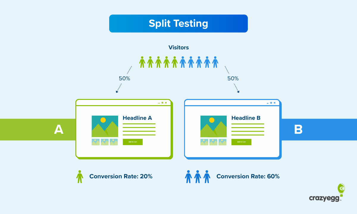
A/B testing is a way to compare two versions of a landing page to see which one performs better with real users.
You show your existing page (version A, the control) to half the website visitors, and show the other half a slightly modified landing page (version B, the variation). Once enough users have passed through the test, you can measure which one had a higher conversion rate.
Conversions are the action that you want people to take on the landing page, such as purchases, signups, or downloads. Increasing the conversion rate means you can generate more revenue or leads without additional traffic.
How it works
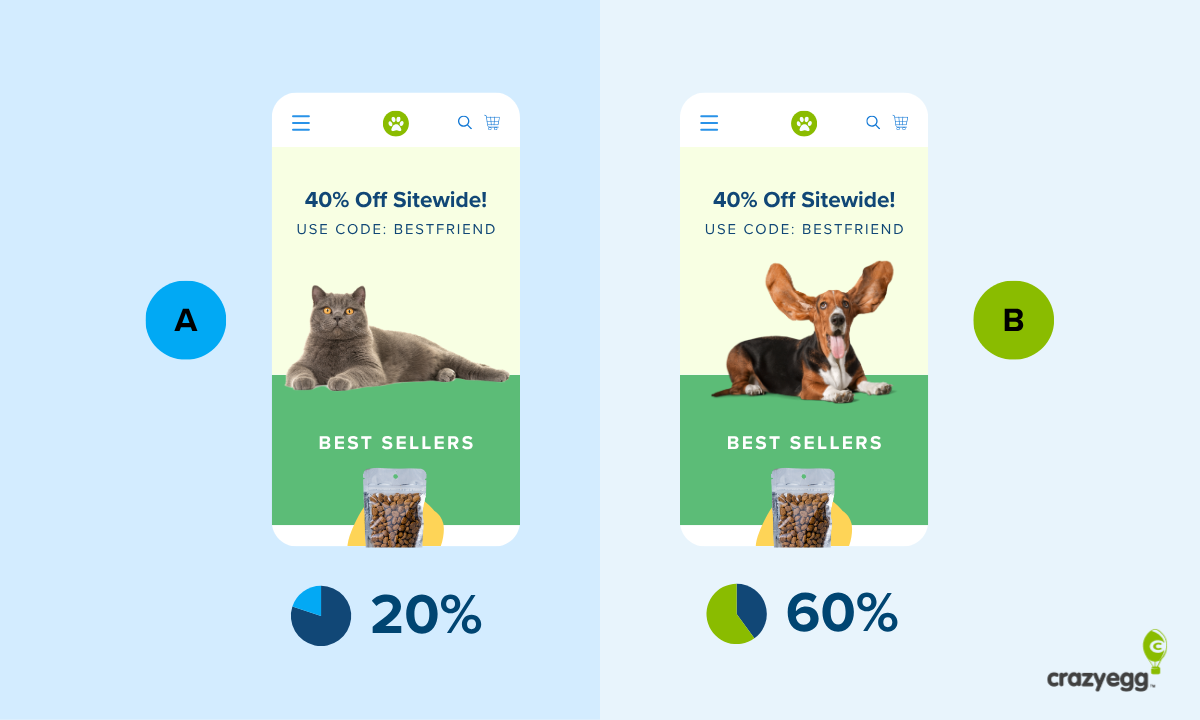
The key idea behind A/B testing is that you only change one thing. It could be a headline, an image, or a small layout adjustment.
By keeping everything else the same, you can isolate the impact of that specific change. This allows people to demonstrate causality, to be able to say with confidence that the one thing they changed (and only that thing) is responsible for the outcomes observed during the test.
Here’s a simplified overview of the A/B testing process plays out on a landing page:
- Traffic going to your landing page into two groups. One group sees your existing page (A) and the other sees the slightly modified page (B).
- Conversions and other engagement metrics are tracked for both versions.
- Once a large enough sample size of users have passed through both versions to reach statistical significance, the “winner” is declared based on the actual live performance during the test.
A/B testing tools handle all the calculations for sample size, statistical power, as well as the practical backend stuff like randomizing web traffic and splitting it between versions.
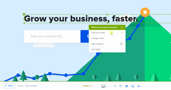
They also provide a content editor, which lets you create variations of your landing pages. These are generally no-code editors. It’s all point and click. Non-technical teams can create test variations without developer help.
In the Crazy Egg editor (pictured below), you can change things like text, styles, colors, fonts, font sizes, and where elements are placed. You can edit HTML directly, but most changes are simple drag and drop.
Since the tool handles all the math, you don’t have to be a statistician to start running tests. That said, it’s definitely a good idea to have a basic understanding of concepts like hypothesis testing, statistical significance, and minimum detectable effect.
A/B testing vs other methods
If you want to test more than a single change, you will need to use a different experimental design. Here are three alternative test methods that are often used on landing pages:
- Split testing is used when you want to compare very different versions of a landing page. This could be a totally different aesthetic, layout, or messaging strategy. Split testing is useful for testing big changes to see whether they are safe or beneficial.
- Multivariate testing is used to test multiple small changes at once. Traffic is split between every possible combination of elements to find which one works best. Multivariate testing is useful for refining landing pages that are working well as opposed to exploring big changes.
- A/B/n testing is used to test multiple landing page variations at the same time. It’s useful for exploring a wider range of page design concepts faster than A/B or split testing allow.
Reasons for A/B testing a landing page
Nobody is doing this because it’s easy. A/B testing is a lot of work. Be skeptical of anyone who tells you otherwise.
The reason that companies pour so much time and effort into A/B testing landing pages is because it creates real value. You can:
- Increase the conversion rate, which makes the landing page a more profitable acquisition channel. You are getting more sales, signups, etc. from the same amount of traffic.
- Learn what actually resonates with your customers, which helps you steer your marketing and sales strategy. You can see whether or not your audience truly finds your messaging strategy compelling.
- Back your decisions with real user data, which is better than guesswork and assumptions. You can prioritize changes that actually improve your landing page instead
- Improve the user experience, which drives engagement. A/B testing can help you identify confusing layouts, points of friction, and other factors that slow people down.
Check out these excellent landing page examples. I can’t say for certain, but I would bet big money that every single one has been optimized using A/B testing.
How Much Traffic Do I Need To A/B Test A Landing Page?
If your page gets, on average,10,000 website visitors per month or more, you are good to go.
That’s not an exact number by any means, and if you have slightly less than that, you might still have enough traffic to test.
The rule of thumb is you want to get at least 1,000 users through each version each week. For A/B testing, that’s two versions, so 2,000 visits per week.
Monthly traffic of 10,000+ means a landing page should easily hit this threshold.
You could potentially go as low as testing a landing page with 8,000 monthly sessions, but that is just scraping by. If for some reason traffic dropped during testing, it might take you the entire month for the test to reach statistical significance.
It becomes very difficult to make progress with A/B testing when there is not enough traffic.
Less traffic-intensive methods for gathering data to make decisions about your site include tools like session recordings, surveys, and scrollmaps. These can provide rich insights on user behavior while you increase traffic to your landing page.
Which Landing Page Elements Should I A/B Test?
This is a short list of the go-to page elements that almost always have a direct impact on the conversion rate.
- Headlines: These are the first things people read on a website. The headline shapes how they perceive any visuals and how they make sense of the writing that follows. Great headline writing is a huge boon to conversions, and a poor headline will cause your bounce rate to skyrocket.
- Call To Actions (CTAs): This is the specific button, link, or form that prompts the user to take action. Creating a more enticing CTA by adjusting the wording, color, placement, or size can have a drastic impact on the conversion rate.
- Visuals: What people see on your landing page should create an emotional response and build trust. Testing different images and videos can help you figure out what engages your audience and what they ignore.
- Menus: Dropdowns and other interactive menus can help users educate themselves and find what they need. Or, they can be confusing and unnecessary. Test different styles to see what improves user experience, and what makes them frustrated.
- Forms: Test the number of form fields. You might be able to pick up additional information without decreasing conversions, or you might be losing conversions because you are trying to get too much up front. Experiment with different types of inline verification, auto-fill settings, and field labels.
- Page layout: You can’t test major redesigns with A/B testing, but you can rearrange different sections of a landing page. Are you presenting information in the best possible order? Are typography elements enhancing the user experience and keeping the focus on the CTA?
- Trust signals & social proof: These are the visual and textual evidence on your site that you other people think your brand is worth trusting. Think of trust badges, customer testimonials, press mentions, and other types of social proof. Experiment with different formats and placements.
7 Steps to A/B Test a Landing Page
This process takes a few weeks to complete and requires a clear plan. The following list of steps is focused entirely on how to start using A/B testing for landing pages. All of the examples, tips, and strategy
If you are completely new to it, consider reading this post on A/B testing basics, which covers the key concepts in greater detail.
Or, just jump right in and learn by doing.
There’s no sense in trying to test a landing page without one.
A good A/B testing tool handles all the calculations, traffic-splitting, and conversion tracking. You are just on the hook for building tests and pressing start.
As you consider your options, there are some important differences between tools that can help
At glance, all these tools look about the same, but they all have their quirks and limitations. The most important factors to consider are:
- Ease of building tests: This is subjective. Some tools are built with developers in mind whereas others offer a no-code interface to design landing page variations. Find something that you and your team feel confident with.
- Annual cost: Ignore any promotional pricing gimmicks and assess the total cost based on a yearly subscription. A/B testing takes time. You want to know that you can stick with the tool for long enough to make real progress.
- Tools for deeper analysis: All A/B testing tools track the conversion rate, but some offer richer data in the form of heatmaps, clickmaps, session recordings, and error tracking.
- Integrations: Most tools are easy to connect with Google Analytics 4, but some offer integration with CRMs, ad platforms, business intelligence tools, and more.
- Testing methods: Some tools do A/B testing only, whereas others let you run split, A/B/n, and multivariate tests.
Here’s what I’d avoid if you are looking to A/B test landing pages:
- Tools originally designed for email or product management (even if they can do landing pages)
- An interface that you thinks is clunky, slow, or above your abilities
- A price that you worry about paying down the line
- Plan limitations that will slow you down (i.e. max # of concurrent tests)
- Tools that have a reputation for causing performance and SEO issues
I would demo any A/B testing tool before committing. There are plenty of options out there. They all handle a little bit differently. People have strong opinions about what’s good, what’s not, and which tools are wildly overpriced.
Develop your own strong opinions about A/B testing tools and pick something your team feels comfortable using.
2. Start planning tests
There are going to be more good test ideas than you have the opportunity to test. That’s just the reality of running A/B tests that take 2 weeks to collect sufficient data.
On average, you are going to be able to try two experiments per month on a landing page. You can increase the cadence to every week (if you have the traffic), but it introduces a little bit more noise into your experiment.
Every test has to count, and while you can’t guarantee a good outcome, there are a few important things you can do to give yourself the best chance possible.
Create a strong hypotheses
Each test has to have a clear hypothesis that’s directly tied to business objectives. Some examples:
- We think that emotion-driven copywriting will increase conversion rate by 10% compared to the existing corporate style.
- We think that an explainer video will increase the conversion rate by 8% when added to our existing comparison landing page.
- We think we can increase our price by 15% without suffering a loss to conversion
These example hypotheses define success with a clear conversion rate goal. Both the strategy of the test and what success looks like are plainly stated.
Always use specific numbers when describing the change you are looking to see. There are too many ways to game the data (or be fooled by it) when you shift the goal posts.
Test changes that are likely to impact user behavior
Only test page elements that are:
- In a highly visible place that all users experience
- Likely to influence the conversion rate
If people don’t see the page element you changed, your A/B test isn’t really testing anything. Stick with testing elements and areas that most of your customers experience. Anything above the fold is good. A few scrolls down is probably okay, too.
If you want to test lower parts of a long landing page, use a scrollmap to see if a critical mass of users are likely to experience the change.
It seems simple, but every hypothesis needs to pass the sanity check that it does, indeed, have a chance of influencing conversions. I’ve been on A/B testing teams where we’ve talked through really cool ideas for changes that, upon further inspection, were not likely to move the needle at all.
One easy way to stay on track is to test areas of the page that are well-known to impact the conversion rate, like CTAs, trust signals, and headlines.
Build a case for your hypothesis
Why do you think making this change will improve the conversion rate? If the strategy is to use emotional vs corporate copywriting, for example, what’s the justification?
The clearer you can spell this out, the better. For one thing, you are probably going to run lots of tests. It’s helpful to have a quick description of why you ran this test so you can avoid repeating the same strategy again in the future.
It’s also a good gut check. With a little research, you can validate whether or not there’s a basis for the test, and potentially pick up some ideas about how to execute your test idea better.
Here are places you can find useful data:
- Web analytics data on your site. Get a sense of how users behave and what they engage with the most. Consider using click maps to determine which specific page elements get the most attention and which users ignore.
- Customer reviews and social listening tools. Find out what users have told the world about your product and how they perceive your brand.
- Internal customer data. This includes any qualitative data you have from surveys, interviews, sales calls, and service tickets. What bothers your existing customers the most? What are the most common objections? What makes them the happiest?
Check out these real-world A/B testing examples for inspiration about what kind of questions you should be asking in order to come up with impactful tests.
3. Prep Your Landing Page for Testing
The single worst use of A/B testing is to find changes that you should have already made.
At the very least, I would run a conversion rate optimization (CRO) audit on your landing page before testing. This ensures that you don’t have any glaring issues that will mess the test up, and that you have already taken advantage of every low-hanging CRO opportunity.
While you audit the landing page, collect the last few months of performance data.
You will need to know the average monthly conversion rate and average monthly traffic for the landing page in order to run an A/B test. If there are other metrics you care about and think the test might influence (e.g. revenue per session), I would collect them, as well.
Break this data up by device, so you can see the percentage of traffic and conversion rates for both mobile and desktop users. This will be important for analyzing results so you can see the impact of the test on different devices.
A/B testing is time consuming. There is no reason to have to test your way into discovering that making the CTA more prominent increases conversions. That is common knowledge, not something you need to spend time finding out.
4. Run an A/A Test to Confirm the Baseline
An A/A test compares two identical versions of your landing page to make sure that your testing setup is working properly.
You should see roughly the same performance for both pages. If you don’t, it means there is probably an issue with the tracking or how the traffic is being split.
Also note the specific conversion rate. Is it similar to the average you found over recent months? It ought to be. If it’s not, it also might be a sign that something is wrong with your setup.
This is simply a quick check to make sure that your future A/B tests will be reliable.
5. Build an A/B Test Variation
Once you have a hypothesis that everyone is excited to test, it’s time to start building the landing page variation that half of the users will experience.
Log into your A/B testing tool, enter a URL to test, and specify which device sizes will be part of the test: desktop, mobile, and/or tablet.
From there you can usually edit the variation using a simple drag-and-drop editor. Change the text, make a layout adjustment, swap in a new image. It’s basically the same as a basic landing page builder, so don’t go into an A/B page editor expecting the design freedom of a tool like Figma.
Some A/B testing tools, like CrazyEgg (pictured below), allow you to jump right into the HTML code to make custom changes.
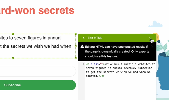
If you know what you are doing, this is really helpful. If you are less familiar with HTML and CSS, I would avoid these features.
I know that the point-and-click editors are limited, but they have guardrails to ensure that the changes you make won’t interfere with the test. When you start messing around with custom code, there’s more that can go wrong.
I’d recommend starting with a low-complexity test that you can get up and running right away. Schedule the tests that require developer help (complex interactive features) or approvals (pricing changes) down the line.
Once you are happy with how the landing page variation looks on every device, go back through and double-check everything. Are the links correct? Are the tap zones for mobile buttons ideal?
Then save the test. Once it is built, it is ready to run. You can usually pre-build multiple tests on a single page, so you do not have to commit to any test until you run it.
6. Setup and Run the A/B test
The workflow and terminology differs from platform to platform, but the core process is basically the same.
Select the page you want to test. It must have a completed variation in order to test.
Then, enter the required inputs to determine the required sample size and test duration. This includes:
- Average monthly traffic
- Average conversion rate
- Minimum detectable effect (MDE)
- Statistical power
- Significance level
You can find the traffic and conversion rate for your existing page in Google Analytics 4 (if you didn’t do it already).
The other inputs may come pre-selected in your A/B testing tool. Do not assume that the defaults are appropriate for your situation. Here is some context to help you decide.
Minimum detectable effect represents the smallest change in the conversion rate that you want to detect. This is completely up to you.
The lower the MDE, the more traffic will be necessary to detect the change. Conversely, a higher MDE will allow you to reach statistical significance with less traffic, but you might fail to detect smaller changes that could have been a valuable improvement.
Statistical power is the likelihood that your test will detect a real effect (if one exists). By default, most tools set this to 80%, which means there is a 20% chance you will fail to detect a real effect. Raising the statistical power reduces the risk of missing an effect, but it increases the traffic requirements.
Significance level is the likelihood that the effect you detected was simply due to random chance. By default, many tools are set to 0.05, which means you are willing to accept a 5% chance that the result was random. You can accept a lower level or risk by setting significance levels below 5%, but it will require a larger sample size.
Once you have entered the information, you’ll see the estimated test duration. As long as that works, you are good to go. Launch when you are ready.
During the test:
- Do not look at the results early unless you want to drive yourself mad. Until the test reaches statistical significance, the data is not reliable. This is why pulling tests early is discouraged.
- Do not change any of the ads or creatives driving traffic to the page. This could easily mess with the results, pulling in a different audience partway through the test.
- Allow it to run in full 7-day increments. If you stop in the middle of a week (say letting a test run for 10 days instead of 14), you might pick up an unnaturally high percentage of weekend traffic. This could skew the results.
7. Learn From the Test Results and Iterate
Once the A/B test has finished running and reached statistical significance, you will get a set of results that includes the conversion rates for both the control and variation, as well as the percentage difference between them.
Here’s a screenshot of A/B test results from Crazy Egg.
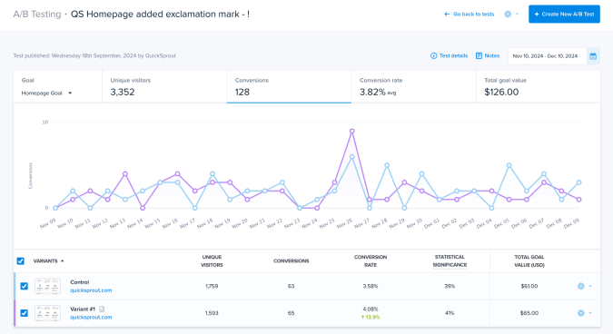
It’s pretty clear to see which version performed best, and by how much, but the real value of A/B testing landing pages comes from figuring out why one version performed better than the other.
Start by looking at other important customer engagement metrics, like time on page, and use supporting tools like click heatmaps to figure out what users are responding to most.
Does anything jump out at you? Are there dead areas or elements that aren’t getting much attention? There’s a classic ecommerce A/B testing case study where Crazy Egg helped Wall Monkeys boost conversions by 27% by identifying and replacing an element that users ignored.
If you don’t see anything useful, try breaking the data out by device. Are there any interesting or worrying patterns of engagement you see on mobile that you don’t see on desktop?
If the landing page has traffic from a variety of sources, I would break it down by audience segment. How does paid traffic compare to organic? How does social media traffic behave differently?
There is a ton you can learn that goes beyond which version had the better conversion rate. Insights you gather during test analysis will help you build better tests as you go forward.