5 Interactive Elements That Users Love Today


An interactive element is a UI feature that users actively engage with.
Think something like a pricing calculator for a SaaS company that charges based on monthly web visitors, for example. Or an interactive quiz on a skincare brand’s website that helps shoppers pick the perfect product.
Below, we’ll discuss which interactive elements are popular today and when you should use them—plus which ones to avoid using.
Types of Interactive Elements
Here’s a quick breakdown of the most common types of interactive elements you’d find on a site:
- Forms. Allow users to input and submit data, from contact details and newsletter signups to feedback forms and checkout processes.
- Quizzes. Ask users questions and often deliver customized answers or insights based on the responses.
- Calculators. Functional tools that let users input data to get specific results, like pricing estimates, ROI, or projected savings.
- Interactive infographics. Visual displays of data that respond to user interaction (clicking, hovering, or scrolling).
- Image sliders. Carousels that let users look through a group of images.
- Chatbots. Conversational robots that help guide users to the right place on a site or connect them with a real human.
- Heatmaps. Visual tools that show where users click, scroll, and focus on a page.
No matter what, these types of elements should always enhance the user experience, not make it more complicated.
These five examples pull this off perfectly.
5 Real Interactive Element Examples
1. Tremendous’ Research Incentive Calculator
Tremendous is a fintech brand that helps companies give incentives like gift cards and cash rewards to employees, customers, and market research participants.
The technology is free to use, minus transaction fees. So instead of a pricing calculator, Tremendous offers a research incentive calculator for potential clients to explore.
Marketing teams can enter details about:
- Study type
- Duration of the study
- Incentive type
- Topic sensitivity
- Target population
- Participant income
- Sample size
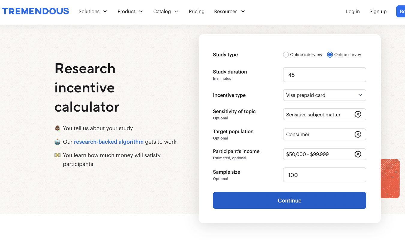
To test the calculator out, I said I was running a survey with the following characteristics:
- Online survey
- Sensitive subject matter
- 45 minutes to complete
- Target audience of consumers with an income of $50,000-$99,999
- Sample size of 100
After an initial input of details, users are prompted to enter their email address and the amount of money they expect to spend on research incentives.
But—and this is important—users don’t have to go to their email to see their result. (Which is super annoying for users to have to do, so avoid that at all costs.) Instead, the result shows up right there on the webpage.
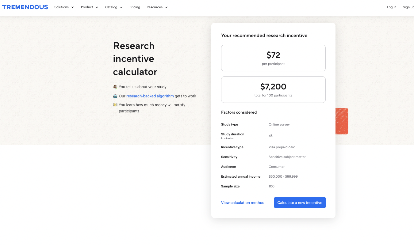
For my mock survey, the calculator told me I’d need to give out $72 in research incentives per participant.
If I want to see how Tremendous calculates this incentive, I can explore the “View calculation method” button.
Key takeaway:
- Use calculators to build trust and educate users by delivering instant, on-page results while subtly collecting leads (email addresses). No friction or waiting for your customers—just instant value.
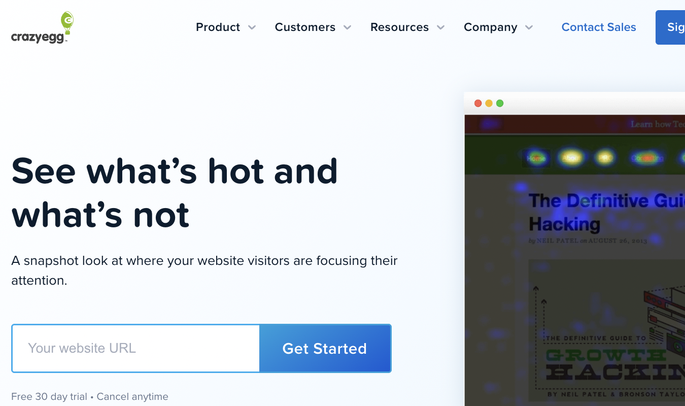
2. Crazy Egg’s Heatmap
Crazy Egg—that’s us!—offers a heatmap tool that shows brands and web designers what people actually click on when they visit your site.
You have to sign up for a Crazy Egg account and a free 30-day trial to use the tool, but it’s worth it. Without a heatmap, it’s hard to know if web visitors are focusing on the buttons you want them to prioritize.
All you have to do to start gathering insights is enter your website URL into the inline form on the Crazy Egg Heatmap homepage.
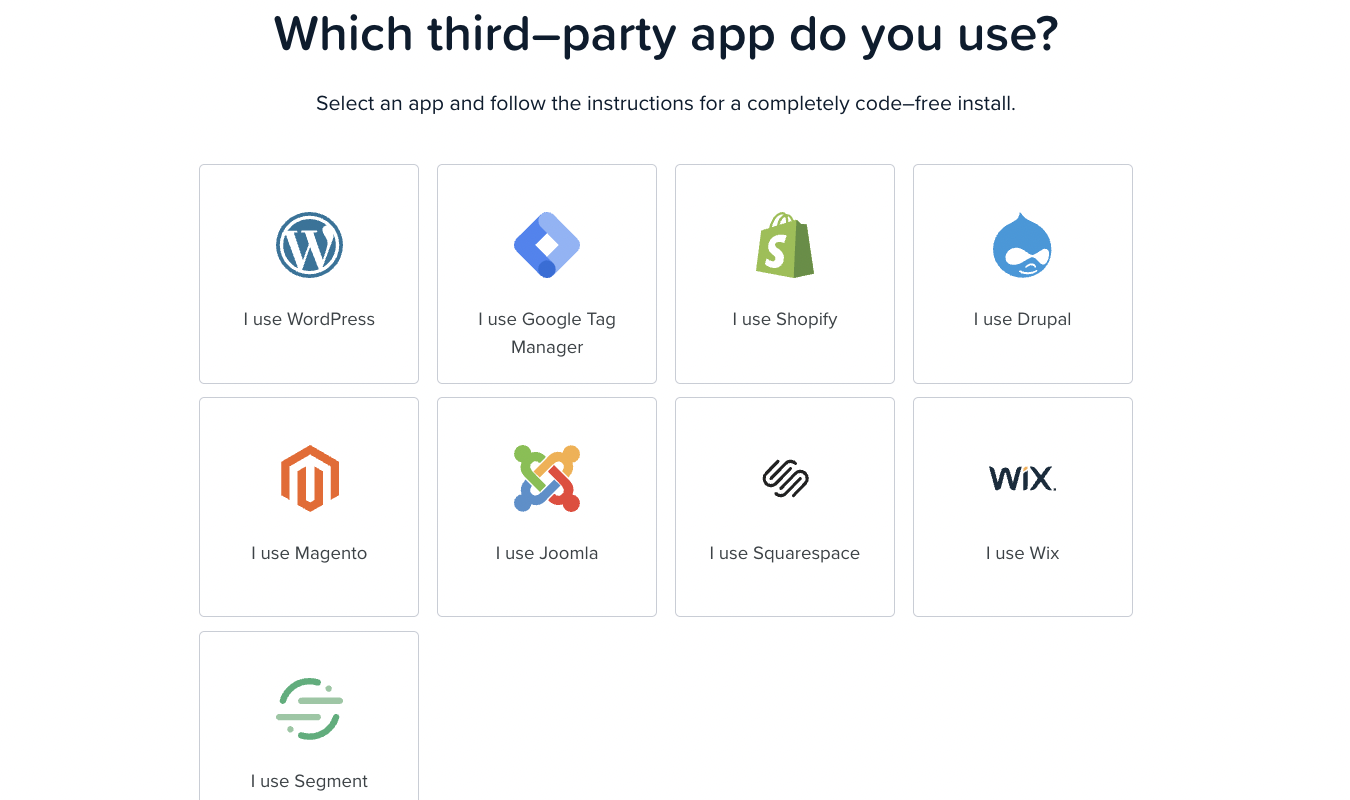
After signing up for a free trial, you’ll be guided through the process of integrating your website with Crazy Egg’s tracking script. This allows our software to track your visitors and collect data on where they’re clicking.
The script is easy to install manually or with one of our integrations.
Once you’re set up and connected, Crazy Egg will track your web visitors and create detailed heatmaps to show you where your website is resonating—and where it’s lacking.
This type of interactive element is a powerful way to drive conversions. Users get just enough information—plus a generous free trial—to propel them through the full sign-up process.
Key takeaway:
- Our heatmap tool at Crazy Egg is a strong example of an interactive element that engages qualified leads right from the homepage. From there, it smoothly transitions them into a high-value free trial with useful insights soon to follow.
3. Uoma’s Shade Finder Quiz
Shopping for foundation online is hard. How do buyers really know they’re getting a shade that matches their skin tone?
Ecommerce skincare and beauty brand Uoma has found a clever way to overcome this challenge for shoppers. Uoma understands that most people who shop for foundation online already use some type of foundation from a different brand.
So it offers a Match My Makeup quiz to make it easy to switch from an old brand to Uoma.
Genius!
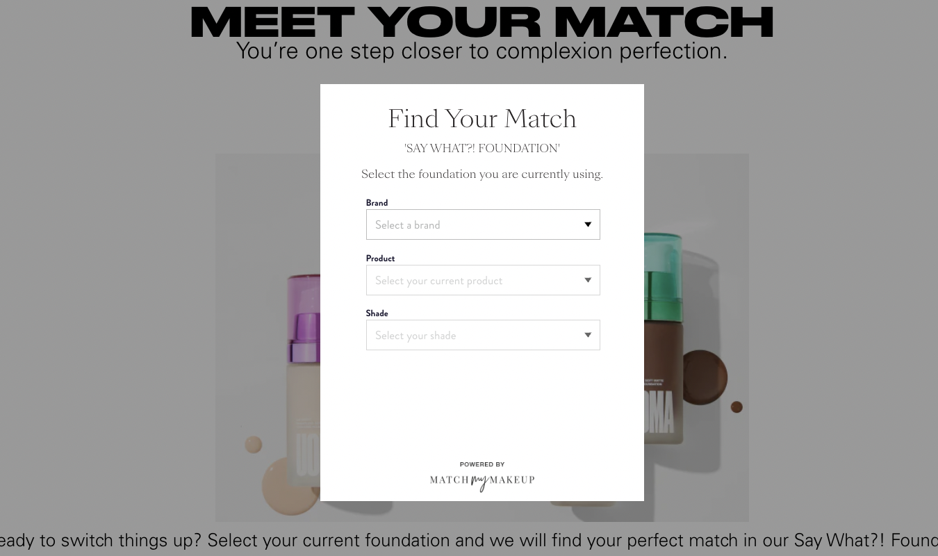
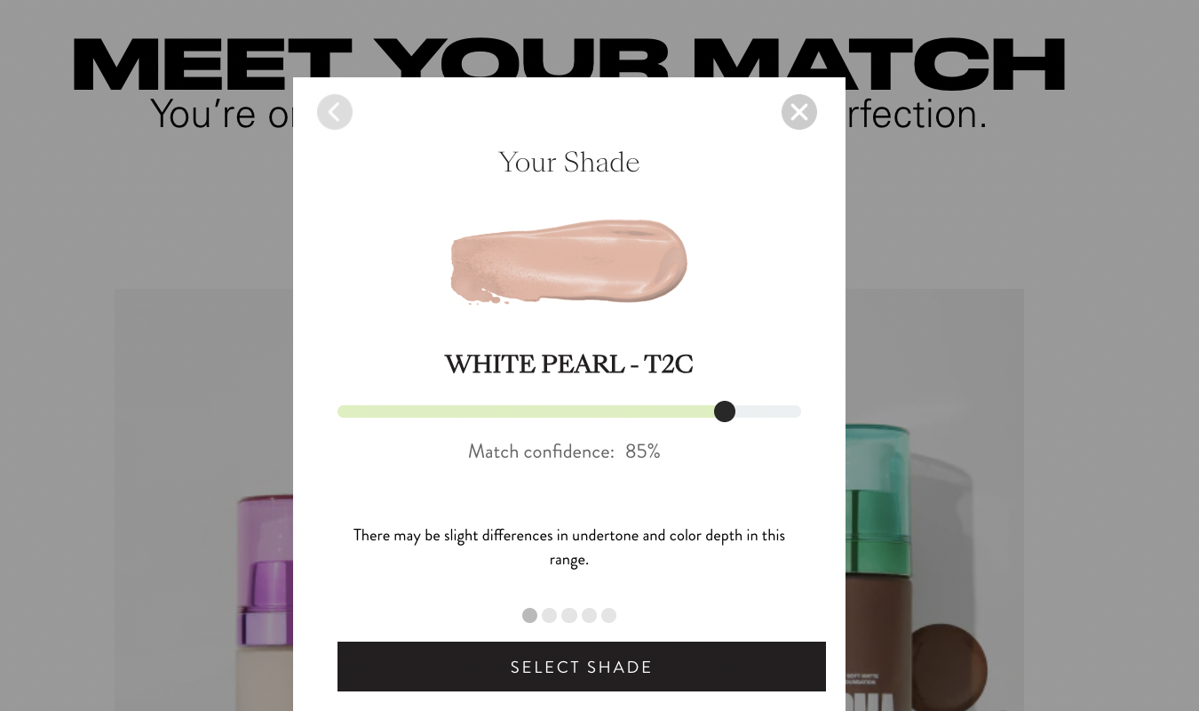
I decided to give the quiz a try. Using drop-down menus, I quickly found the exact match for the type of foundation I currently use: Neutrogena’s Hydro Boost Hydrating Tint in the shade Natural Ivory 20.
Immediately after entering that information, Uoma offered up its closest match: White Pearl – T2C.
Along with the name of the Uoma foundation I could hypothetically switch to, the brand offers key information, including:
- Image of a makeup dab in the matching shade. The visual helps reinforce whether the shade is a good match for my skin tone or not. (It is.)
- Confidence match of 85%. I love that the brand isn’t 100% confident in the match, which would make me feel like Uoma is overconfident and just trying to sell a product at any cost. Instead, I feel informed—and ready to try a new foundation.
- Informational tidbits about why the confidence match isn’t 100%. If I click on the gray dots just above the “Select Shade” button, I get bite-sized bits of information about why makeup can’t always be matched 100%. This reinforces my trust in the company—and my confidence that the folks at Uoma know what they’re talking about.
Key takeaway:
- Uoma’s shade finder quiz is a smart, trust-building interactive tool that meets shoppers where they are. It helps them switch from a product they already use—with visual proof and honest confidence scoring to boot.
4. Neil Patel’s SEO Analyzer
Trying to figure out why your website isn’t ranking on search engines can be overwhelming. It can be incredibly difficult to know where to start troubleshooting.
Neil Patel’s SEO Analyzer streamlines the process and makes it easy.
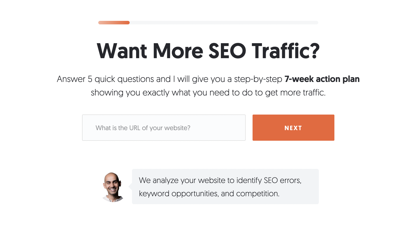
First—before you even enter any information into the analyzer—you get a breakdown of what you’ll get in return: a 7-week action plan that outlines exactly what you need to do to get more traffic.
As someone who loves having a plan in place to fix a problem, I feel instantly reassured when I see a promise like this.
Patel also tells users exactly how the SEO Analyzer does this—by analyzing your website to spot SEO errors, keyword opportunities, and competition.
After entering your website URL, you’ll be asked five questions about your marketing experience, web traffic goals, yearly revenue, marketing budget, and whether you plan to DIY or outsource the work.
Then, Neil Patel asks for your email—which makes sense, in this context, because you’re getting a meaty, 7-week action plan.
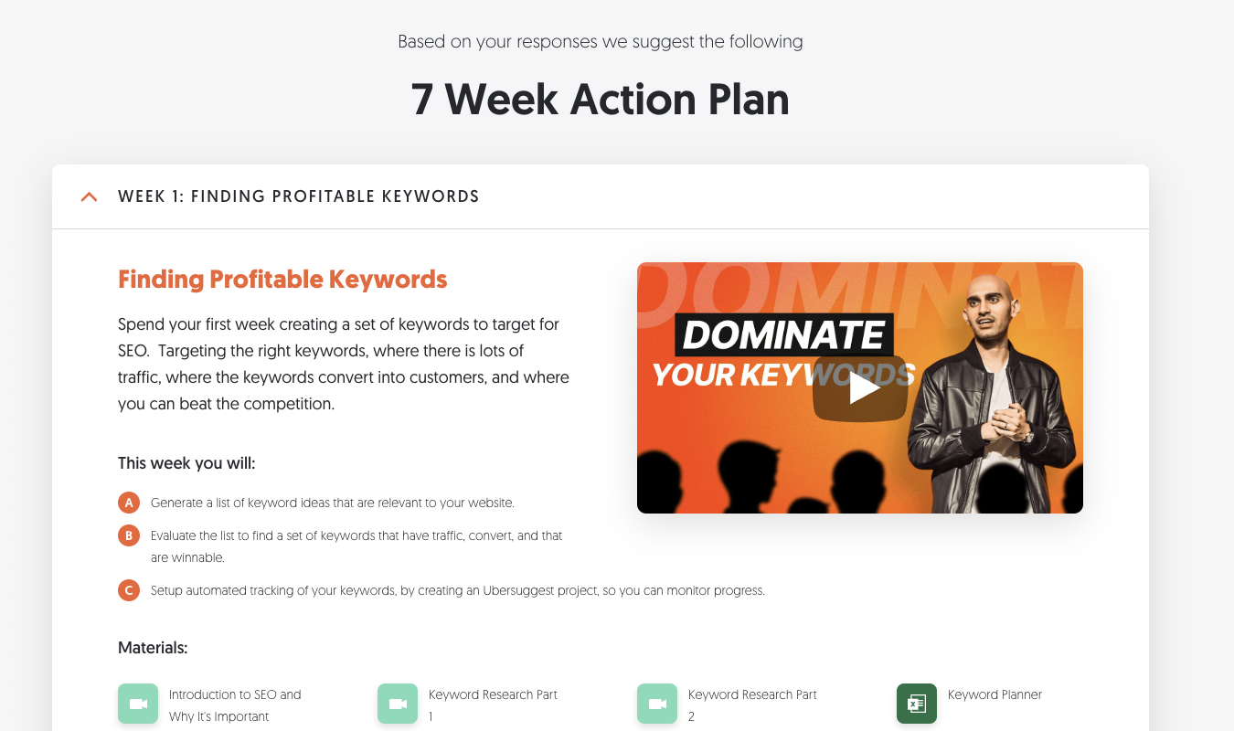
What I love about the SEO Analyzer is that Patel doesn’t just offer steps. He also offers resource materials (videos, guides, and articles) to help you accomplish the steps—ideally using his Ubersuggest SEO tool.
Everything feels manageable, sensible, and helpful.
Key takeaway:
- Neil Patel’s SEO Analyzer is an excellent example of interactive web content that balances value for the reader and lead capture for the brand. It clearly explains what users will get, offers an action plan, and backs it up with resources that help make the next steps feel doable, not daunting.
5. Nike Reactor
The Nike Reactor is a bizarre yet oddly compelling interactive tool that helps potential customers picture how amazing a Nike React shoe would feel on their feet.
Nike React is a shoe line purported to offer 11% more softness and 13% more energy return than previous Nike foam material. The React line is mainly used in the brand’s running shoes.
The goal of the Nike Reactor tool is to create an avatar runner using the features you’d value most out of Nike React’s shoe line.
In the first question, you’re asked, “How does Nike React feel? Nike React feels…”
You must choose two desired features from a list featuring the following characteristics:
- “As light as feathers”
- “As light as soap bubbles”
- “As soft as pillows”
- “As soft as teddy bears”
- “As responsive as space hoppers”
- “As responsive as bouncy balls”
I chose soap bubbles and feathers.
Then, users get to pick their running style. Are they weekend runners? Early-morning risers? Serotonin seekers?
Finally, users pick a favorite color and give their avatar a name.
The reward? You get to watch your bubbly, feathery avatar run with a pair of Nike React shoes.
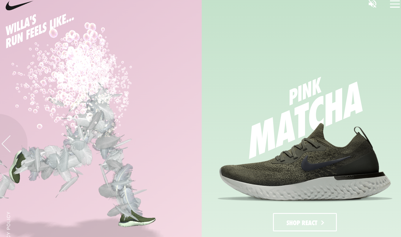
It’s weird yet strangely satisfying to watch my avatar bounce along on her Nike React shoes.
And yes—doing this entire process was fun, and it sparked curiosity about the React line of shoes. As a runner, I’m always looking for footwear that supports the repeated stress of running.
Key takeaway:
- Nike Reactor makes product exploration playful, even online. With this quirky, sensory-first quiz, users get to emotionally and creatively engage with the way they want their ideal shoe to feel.
The Interactive Elements That Are Trendy Right Now
As you’ve probably guessed, quizzes and calculators are fairly popular right now. Personally, I like these types of interactive elements because they’re helpful for me as a user. The number of decisions I have to make in a single day is overwhelming.
I love being able to enter details into a calculator and get helpful information in seconds. Or answer quiz questions and—whoosh!—get a set of recommended products to pick from. These UI tools help ease decision fatigue.
Heatmaps and on-the-page click tests, like Crazy Egg’s heatmap tool, fall into a similar category. For anyone with a website, these interactive elements—which show where people do and don’t click or browse on your website—are incredibly helpful.
Web designers can use the information to instantly improve the flow of their site and drive conversions.
AI-powered chatbots are also popular, and they’re helpful—most of the time. If they pop up on every page and stalk users that don’t want or need them, that’s a big minus.
Far better if they help with something specific and complex. Like onboarding a new user to a SaaS tool or finding the exact type of product an ecommerce shopper is looking for.
Built-in forms are also popular. Instead of showing all forms as pop-ups or making people click buttons that lead them to a form, inline forms are taking over. They’re less disruptive to the user experience and can be an intuitive part of the UI flow.
Interactive charts and visuals are popular today, too.
Everything from homepages to long-form news stories uses interactive visuals to enrich the user’s experience.
Honestly, these are a mixed bag for me. Sometimes I just want to stare at a boring, flat, easily loaded chart. But other folks love being able to hover, click, and scroll all fancy-like.
But I have a prediction: this specific type of interactive element will fall out of style in a few years. Or at least get toned down—a lot.
Interactive Elements You Should Probably Avoid
Some formerly popular interactive elements are no longer useful to web designers and brands.
These include:
- Homepage sliders and carousels. Big images that rotate every few seconds at the top of a homepage are no longer interactive enough for most users. They get ignored, they slow load times, and they perform poorly on mobile devices. It’s better to just clearly highlight your most important content.
- Accordion menus that hide key information. Click-to-expand sections can be useful for FAQs, but they’re just frustrating when they hide important information, like pricing, product information, or comparisons. If it’s something users need to see right away, don’t make them work for it.
- Long forms with no progress feedback. If a form takes more than a few seconds for users to complete, they need some sign they’re making progress. Forms that seem endless or fail to explain what’s coming next often get abandoned. Use simple layouts and quick feedback to help people stay on task.
- Animations that take control away from users. Animations may be cute, but anything that breaks up the connection between a user and your website is a no-go. If anything is moving on your page, it should be something the user can control.
Tools and Platforms to Add Interactive Elements
Ready for tools to help you add interactive elements to your website?
Here’s a breakdown of our favorites:
- WordPress plugins. WPForms, H5P, and Popup Maker help you build forms, popups, and quizzes on WordPress.
- Chatbot and AI tools. Use tools like Tidio or Drift to add a chat window to your site and set it up to answer questions, help folks find products, or hand things off to a real person when needed. For something more custom, like an onboarding bot, use ChatGPT API or Botpress.
- Interactive visuals and behavior tools. Tools like Flourish and Datawrapper help you create interactive charts and graphics to help people explore your data.
- No-code builders for interactive content. No coding skills? No problem. Outgrow helps you create calculators, surveys, and quizzes. Typeform and Jotform are great for quizzes and forms for any occasion.
Resist the temptation to go wild with interactive elements on your website. Remember: the best interactive features add value to the user experience.